Humboldt's Best-Kept Cannabis Secret Needed To Stop Being A Secret.
Client: Northern Harvest Scope:BrandWebsitePackagingCollateral Industry: Premium Cannabis
Evan Roberts
Evan Roberts
Lead Designer, Roberts Design Studio
make it real.
Title: The Gap
The Gap

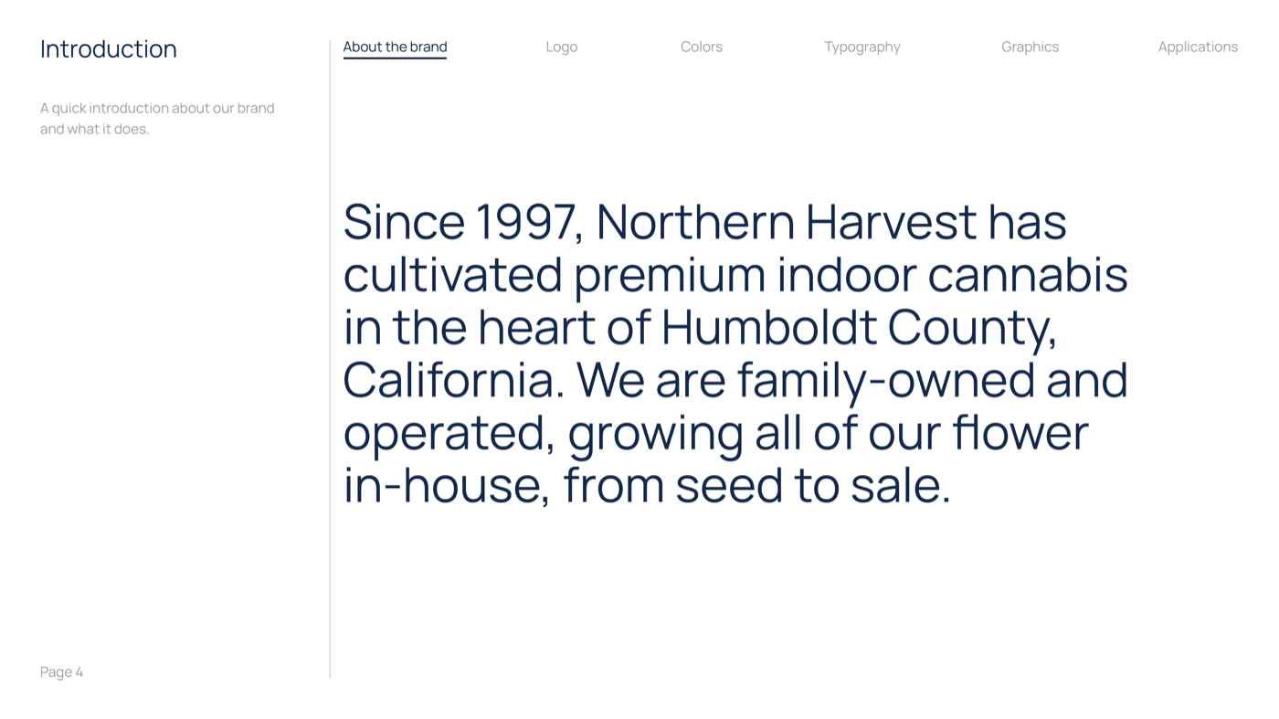
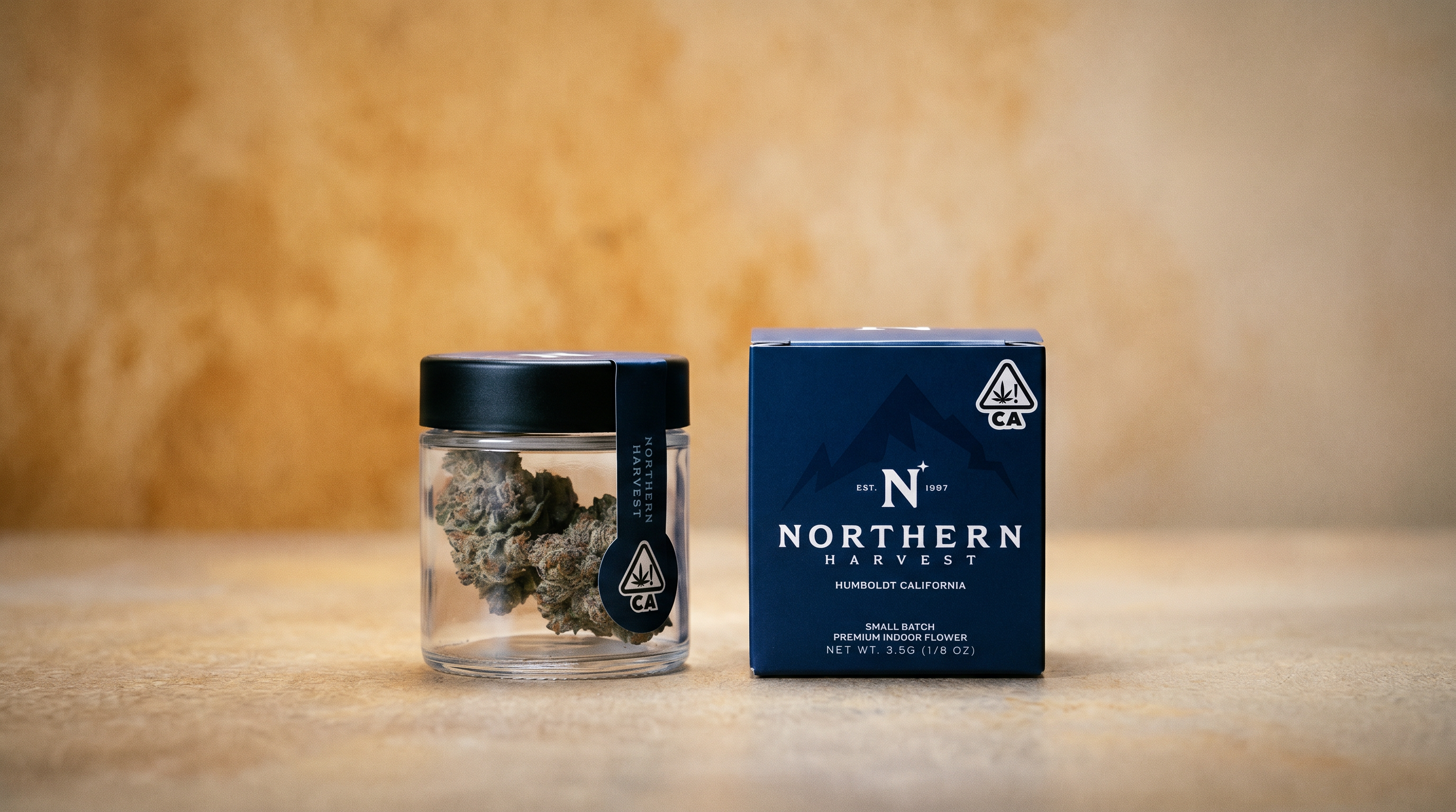
Northern Harvest grows some of the best cannabis in California. Humboldt County, where the brand was born, is the origin point of American cannabis culture. The soil, the climate, the generational knowledge of the growers who work it. This is a heritage operation that had never been given a brand to match what was inside the bag.

When I arrived in December 2025, Northern Harvest had one thing going for it: the flower. Their distributor placed them in 250+ dispensaries across California. The product moved. But the brand was invisible. No guidelines, no system, no story being told. The packaging looked like every other brand on the shelf. The sales team walked into dispensaries with nothing in their hands.

The founder, JT Weigman, had been under pressure from the distributor to professionalize the brand. Their feedback was direct and unambiguous. The product quality demanded premium positioning. Everything else needed to catch up.

"You have some of the best cannabis in California, but you aren't acting like it. Start acting like a million dollar per month brand."
The brand's distributor, placing into 600+ dispensaries statewide
PQ #001 127 Characters
NO WEBSITE NO INSTAGRAM NO GUIDELINES NO COLLATERAL NO PACKAGING NO CONTENT NO ASSET LIBRARY NO BRAND SYSTEM NO IDENTITY NO STRATEGY
0
Brand assets or guidelines when I arrived
250+
Dispensaries with zero branded collateral
4
Months from zero to a full brand system

No website. No active Instagram. No brand guidelines. No organized asset library. No sales collateral. No consistent packaging. No content pipeline. The VP of Sales was walking into dispensaries empty-handed. Previous creative efforts had stalled with no explanation. The brand was positioned as commodity cannabis, not premium.

The distributor had set a monthly revenue target. The product could support it. The brand could not. The founder was under pressure to professionalize everything, fast.

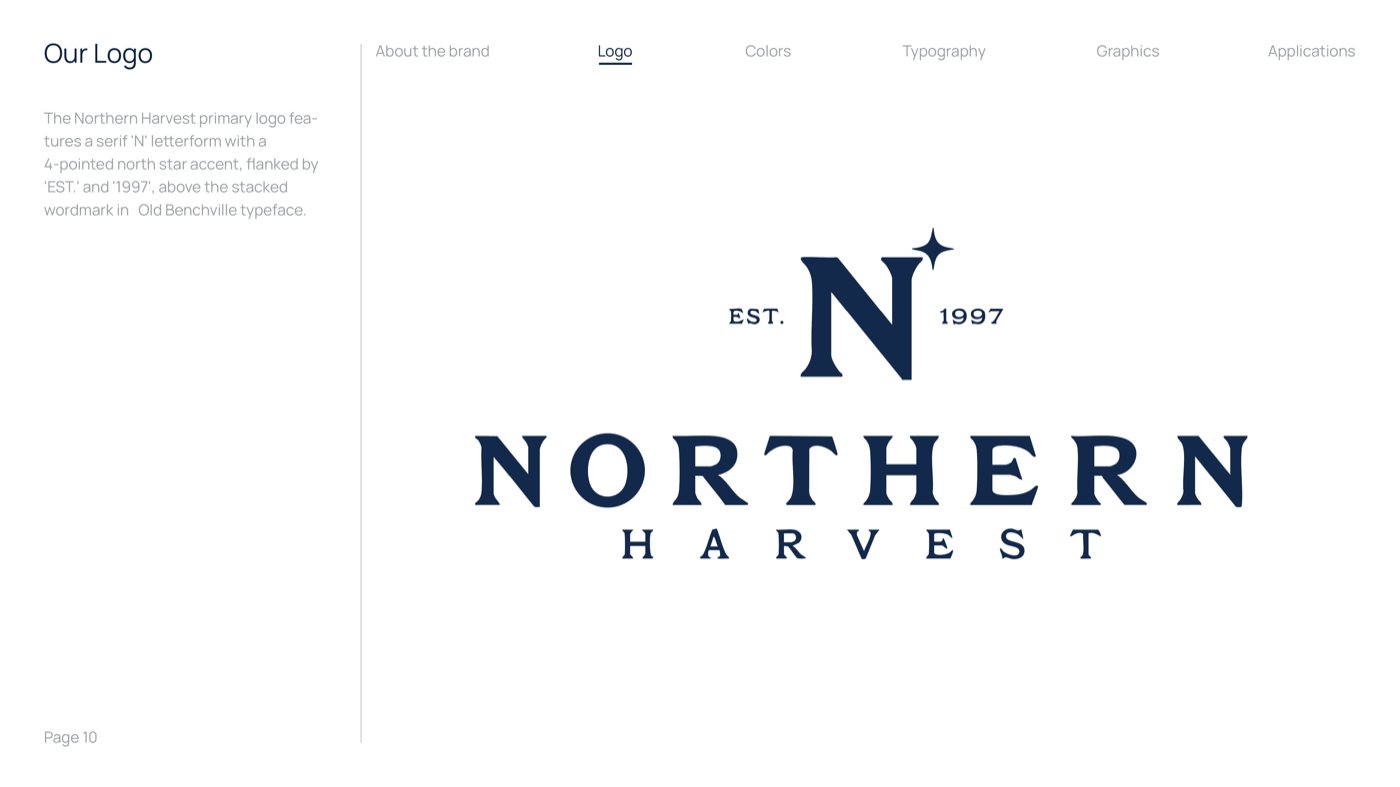
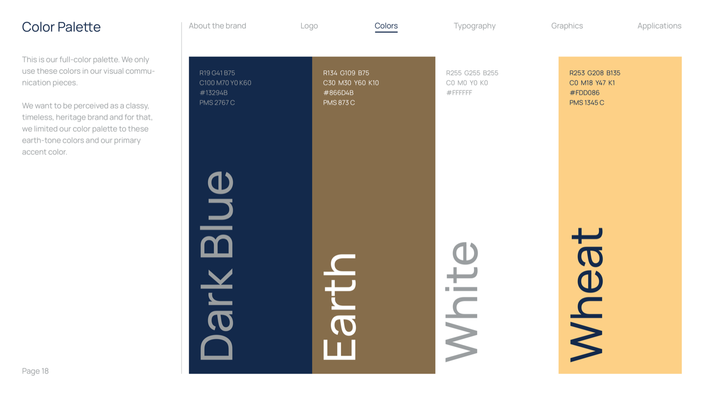
The only things that existed: a logo, a loose color palette, and incredible cannabis. A build from zero. My job was to make everything else match what was already inside the bag.

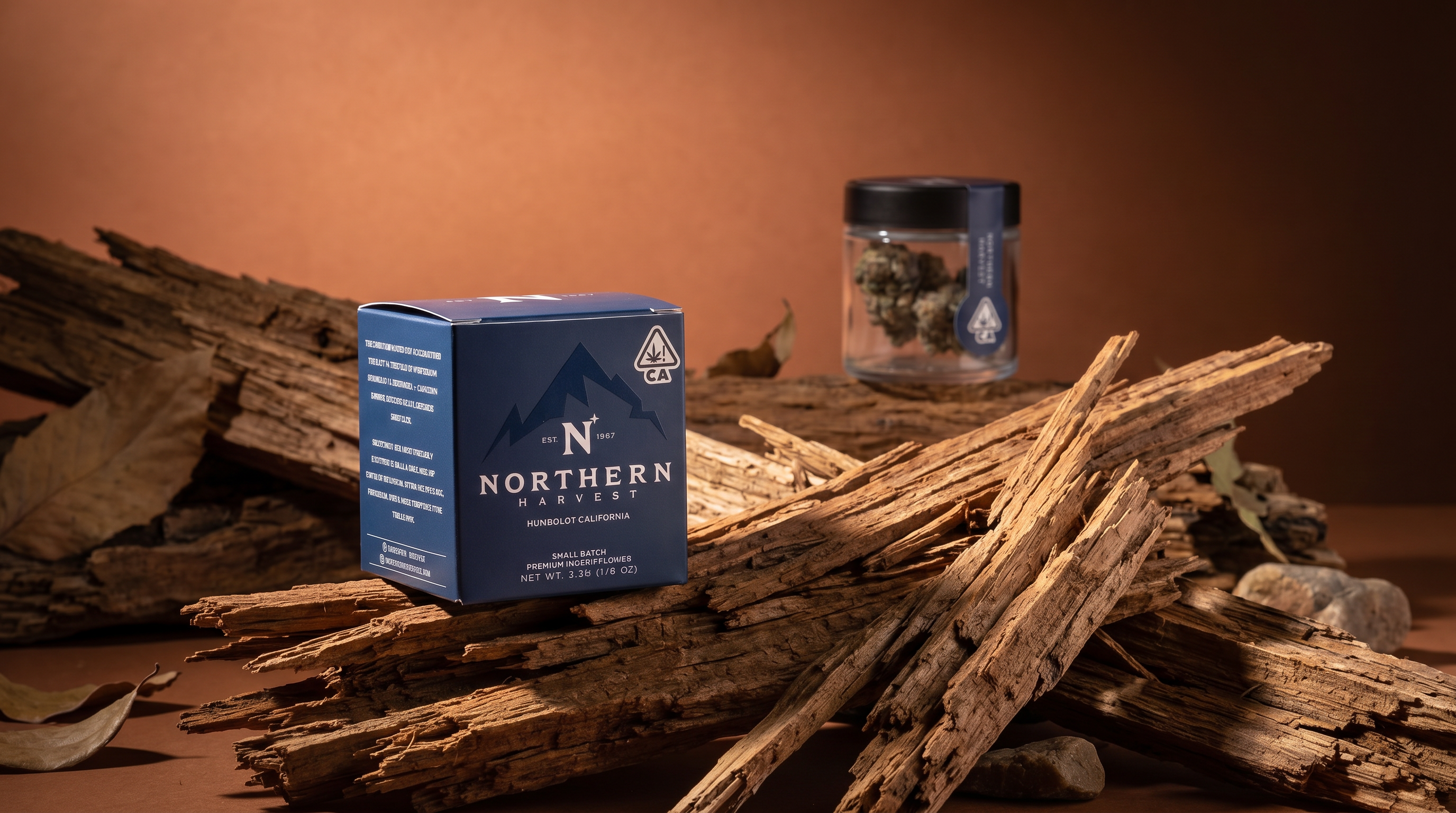
Northern Harvest packaging on shelf
row4-c.png
Title: The Approach
The Approach

I positioned Northern Harvest as a premium heritage brand, not a typical cannabis company. The product quality demanded it. The distributor's feedback confirmed where the gap was. Reference points: Johnnie Walker for premium tiered legacy. Wyld for nature aesthetic done right. REI and Patagonia for understated confidence. Earned.

Every decision ran through one filter: is this how a million-dollar-per-month brand would present itself? If yes, it goes out. If no, redo it. Every stakeholder could apply it without me in the room.

The sales team needed materials yesterday. I prioritized revenue-generating collateral over internal documentation. Menus and sell sheets were in hand by week three. Brand guidelines came after. Field first. The documentation came after, to support what was already in the field.

I built systems that outlast my involvement. Automated menu workflows using CSV-based variable data. Organized asset libraries. Documented brand rules. The brand runs without needing a designer for every update.

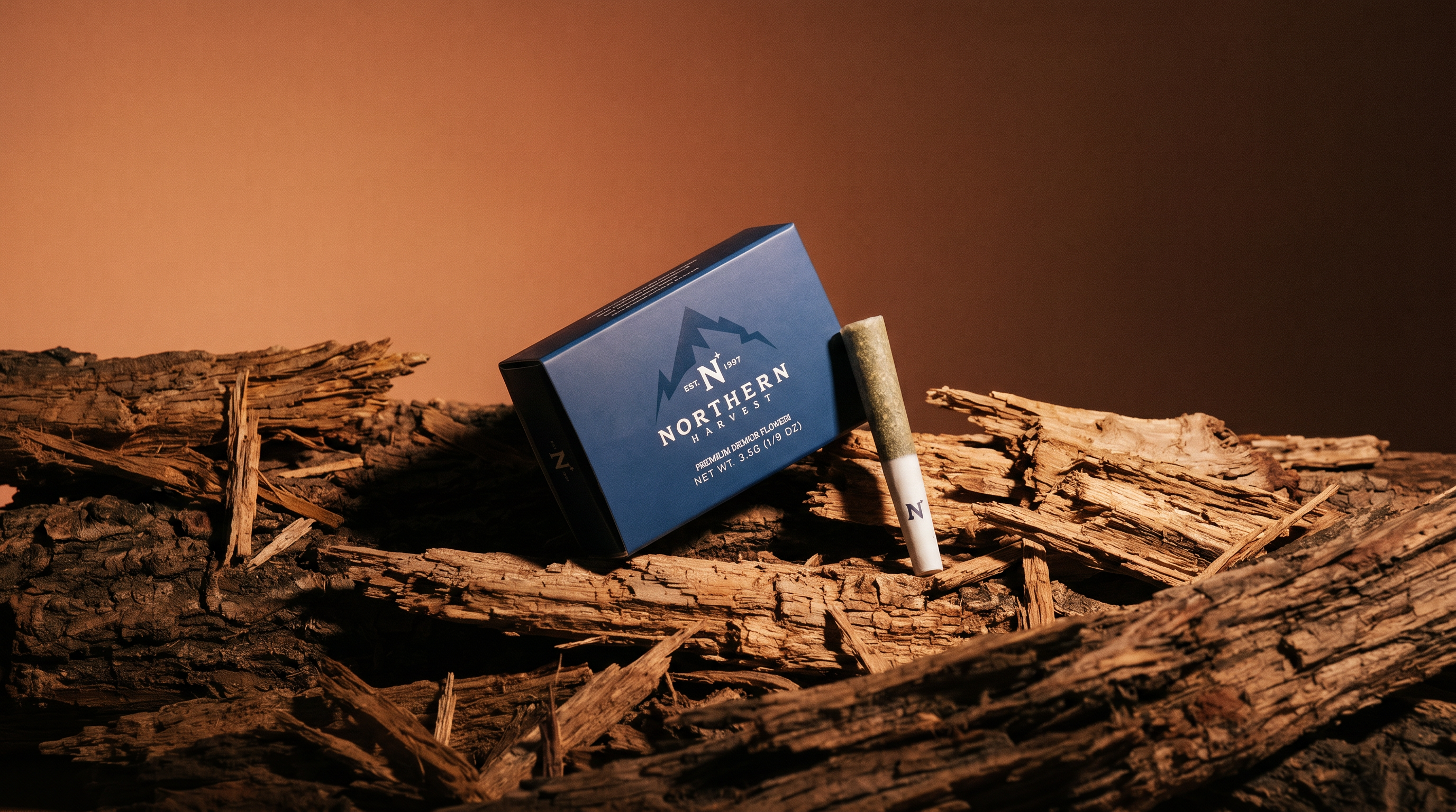
Northern Harvest products in studio light
gap-hero-v2.png
"Is this how a million-dollar-per-month brand would present itself? If yes, it goes out. If no, redo it."
Evan Roberts, Lead Designer
PQ #002 The Million Dollar Test 89 Characters
Key Decisions
Decision Outcome
Heritage positioning over cannabis culture aesthetic The distributor raised its sales projection after seeing the first brand work. Dispensaries began requesting NH materials.
Automated menu system (CSV to variable data) Non-designers now update menu data independently. New strain menus go out same-day.
Field collateral first, brand system second Sales team had branded menus, postcards, and sell sheets in hand by week three.
Code, not mockups Full production website went from concept to deployed without a single mockup file.
Scope of Work
Dec 25 Jan 26 Feb 26 Mar 26 Apr 26
Audit & Direction 3 wk
Sales Collateral 4 wk
Brand System 6 wk
Website 5 wk
Social & Content 4 wk
Ongoing Refinement cont.
Title: Brand System
The System

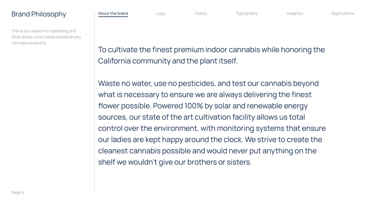
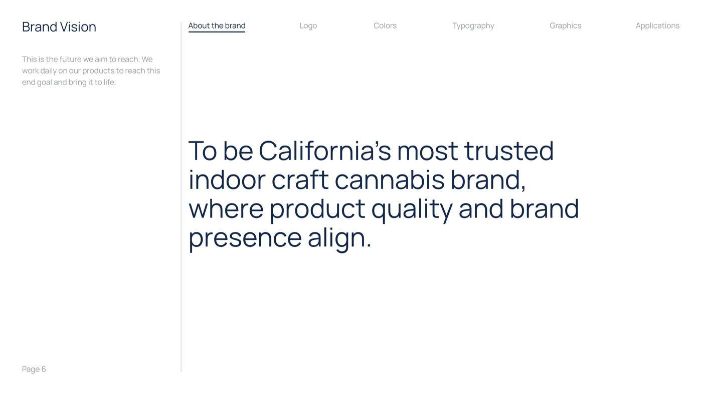
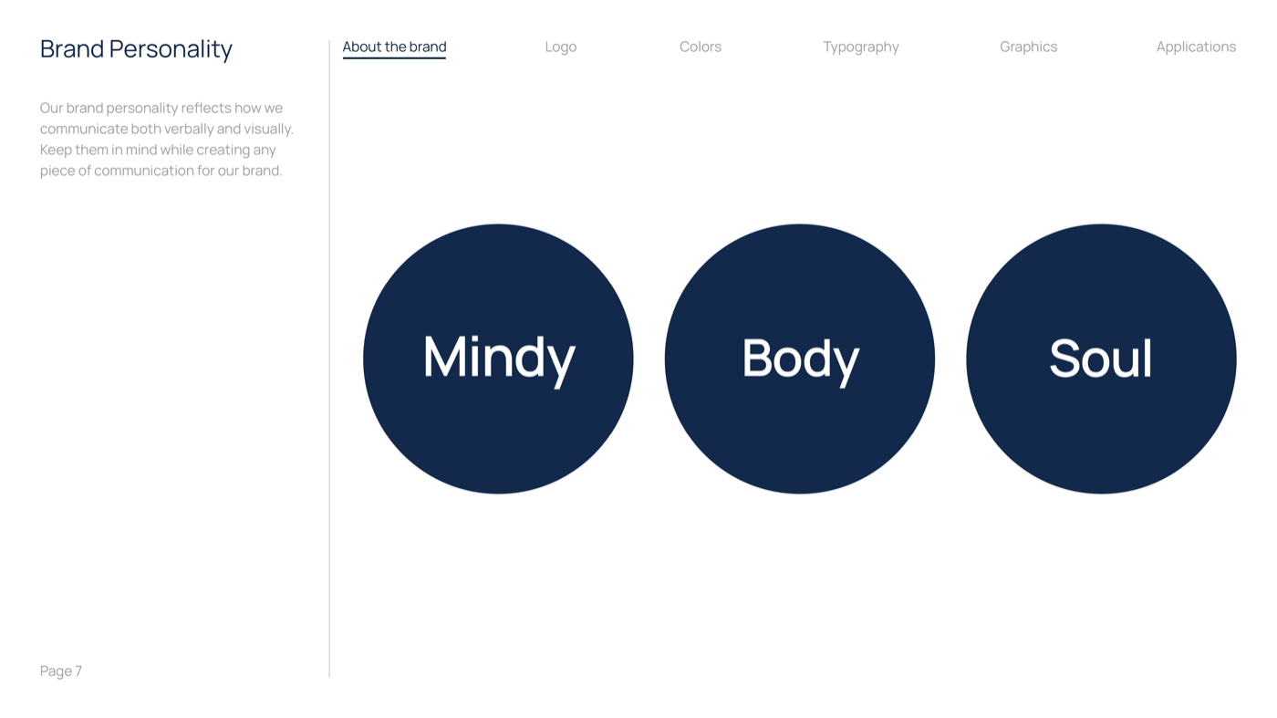
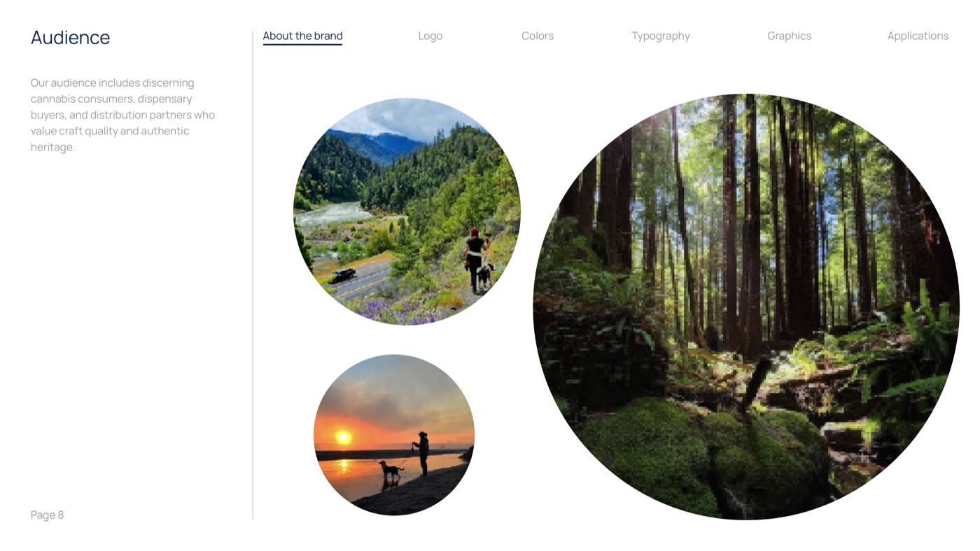
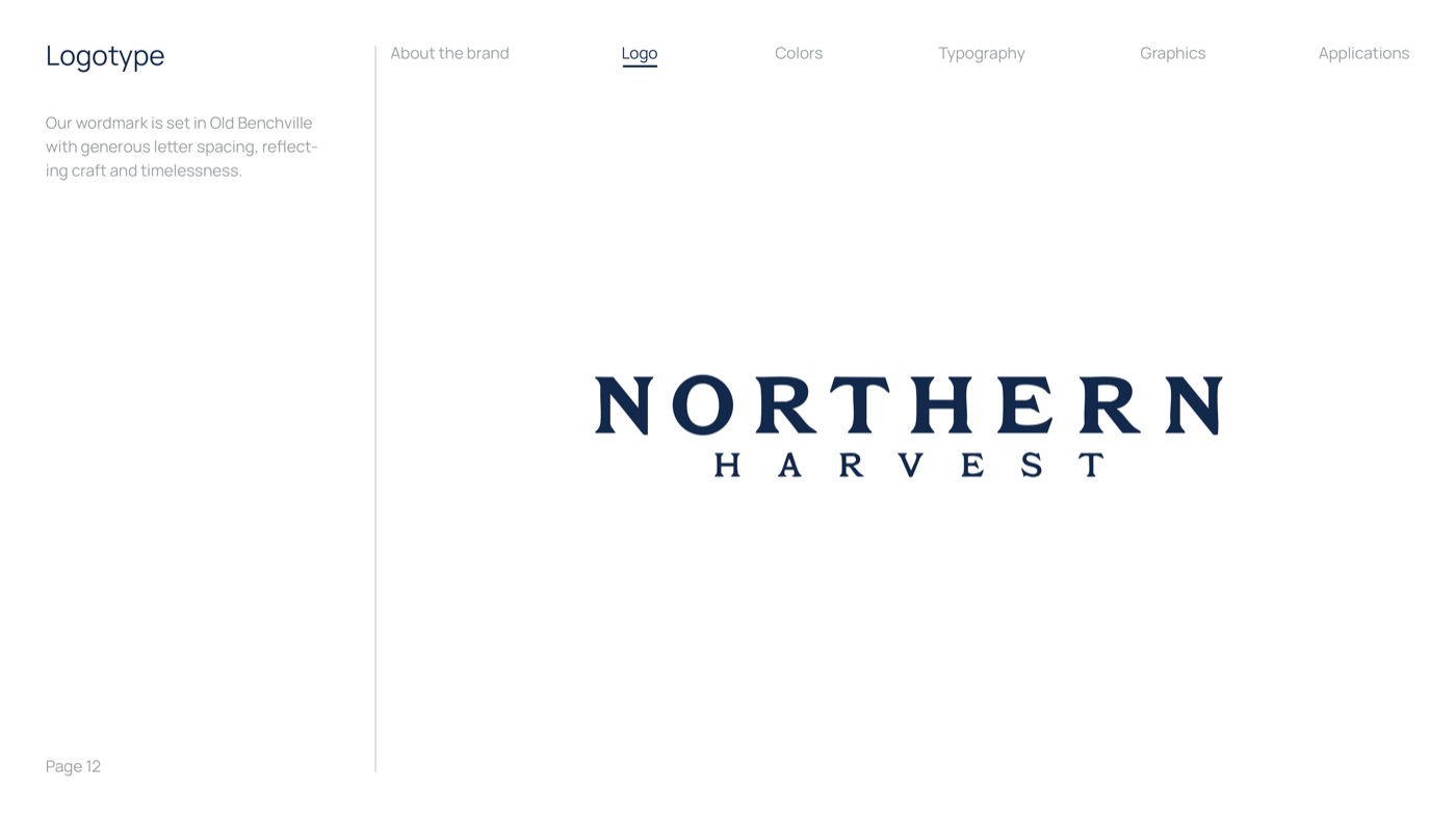
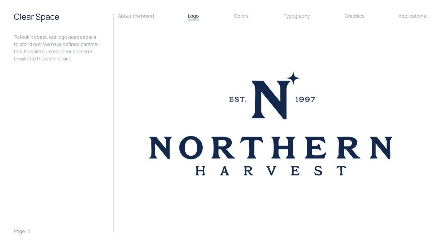
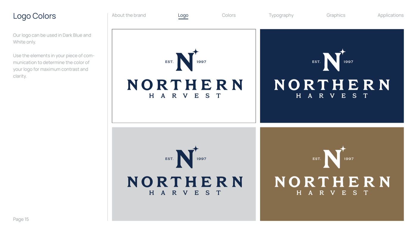
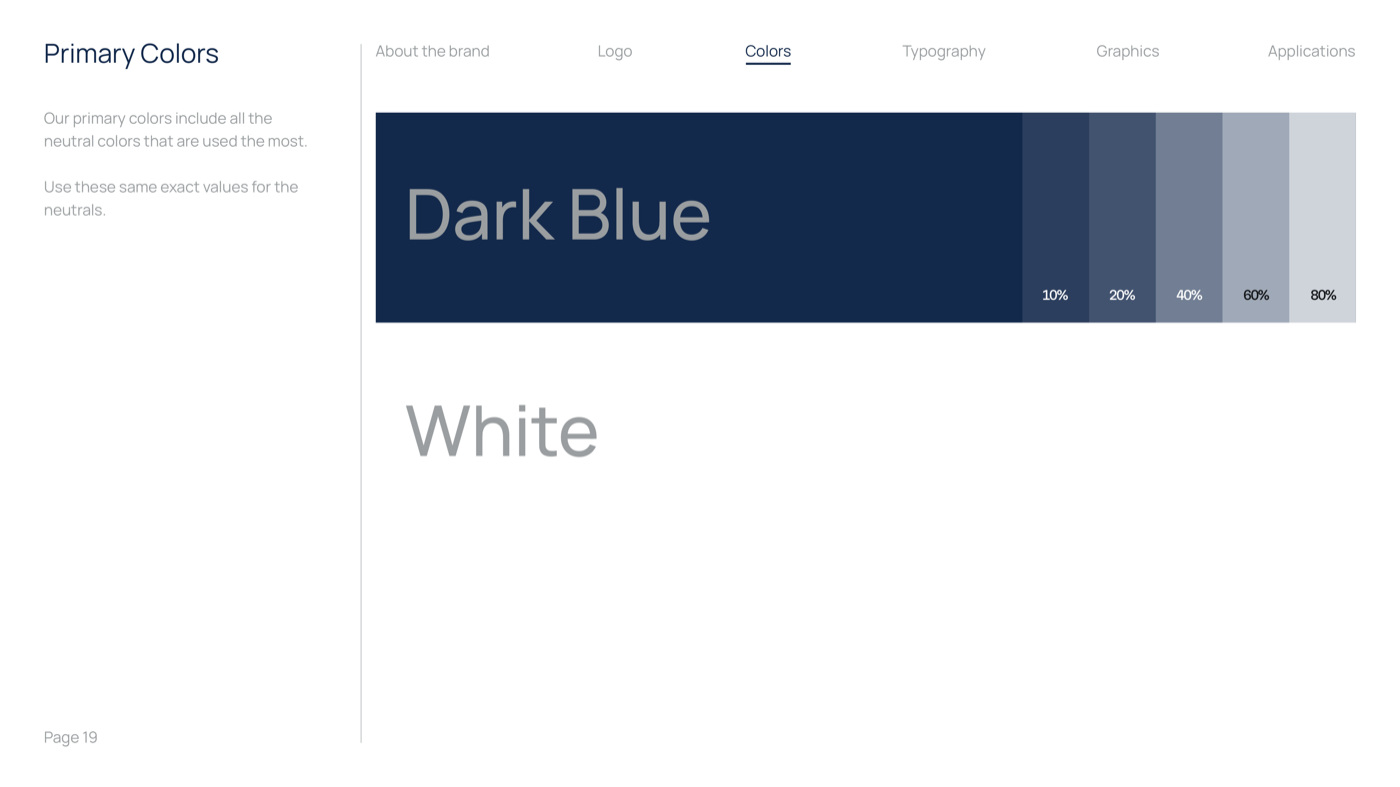
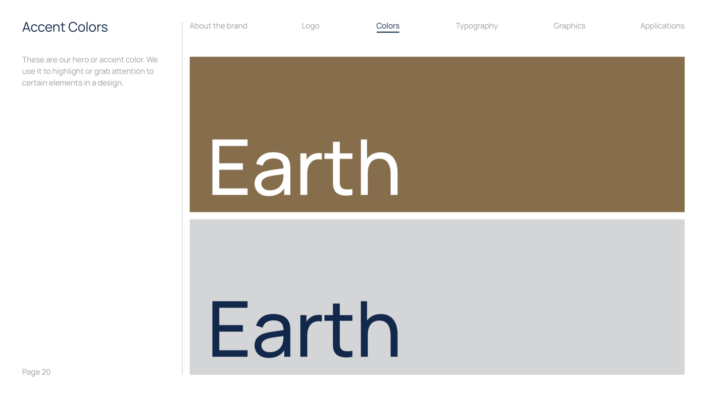
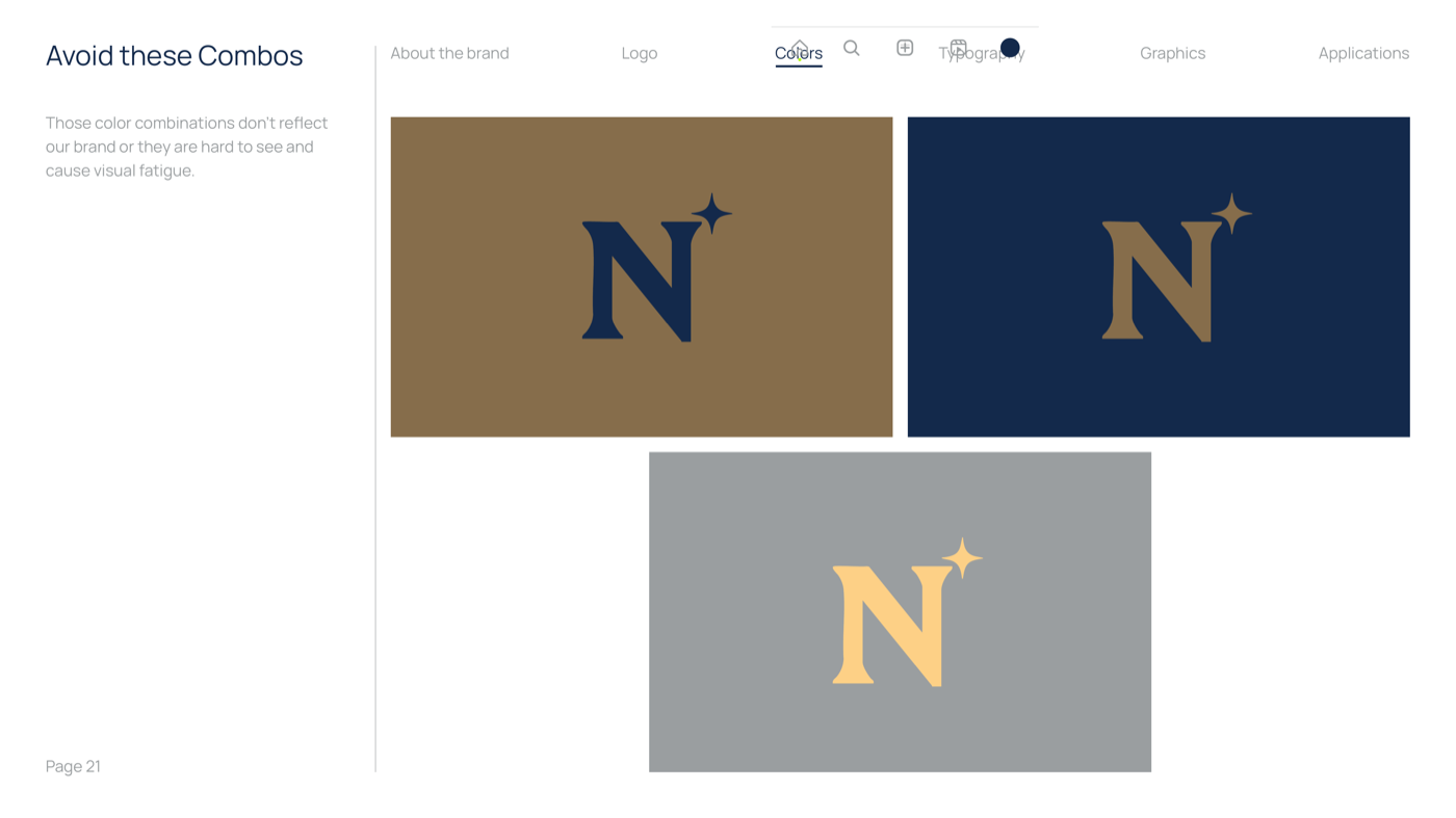
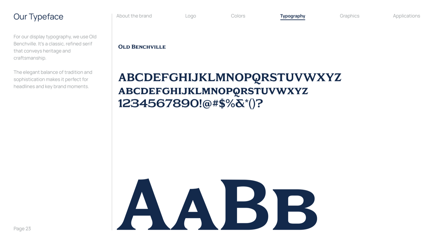
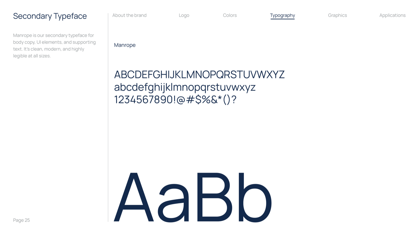
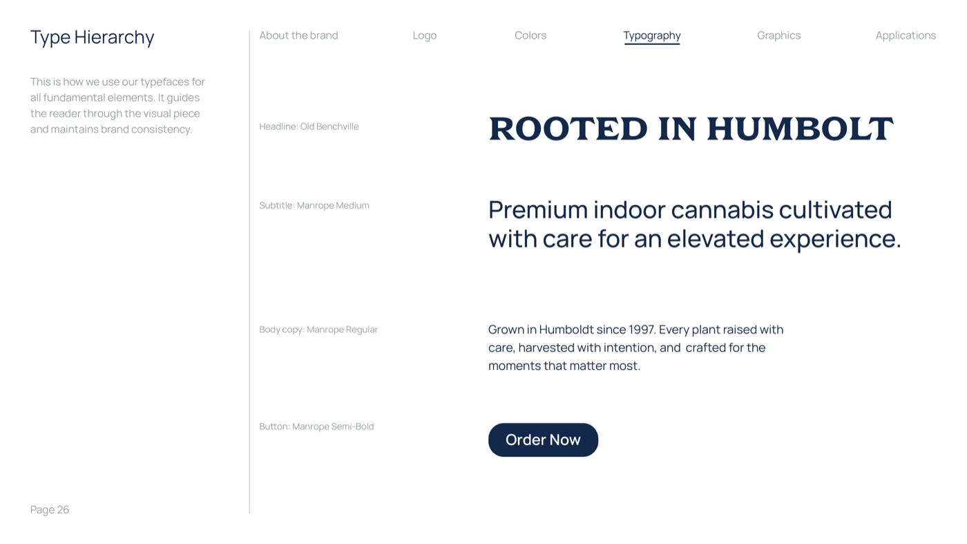
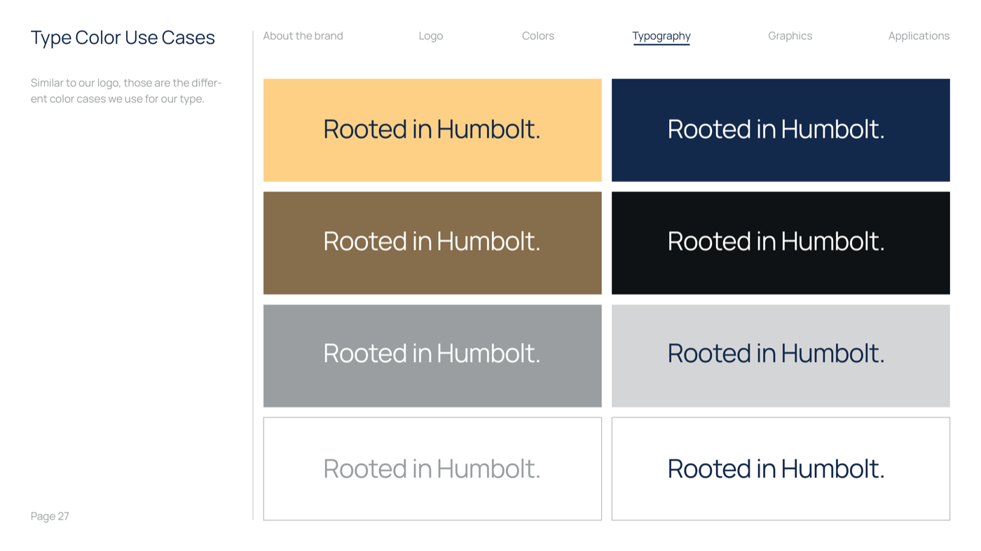
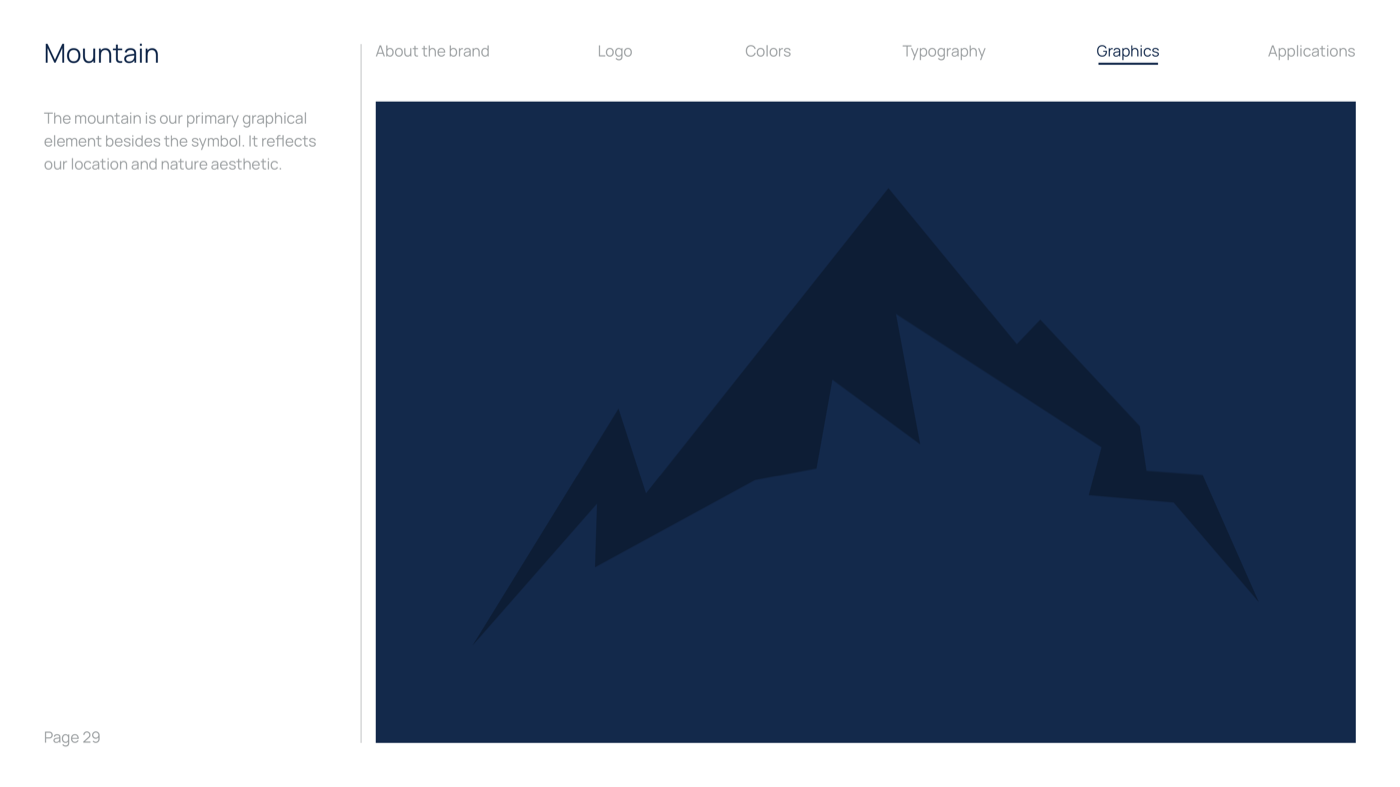
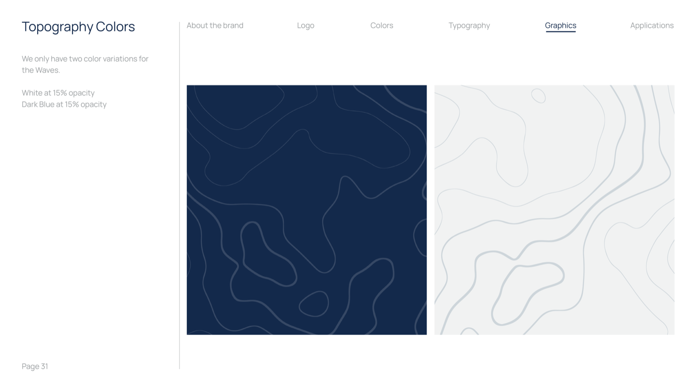
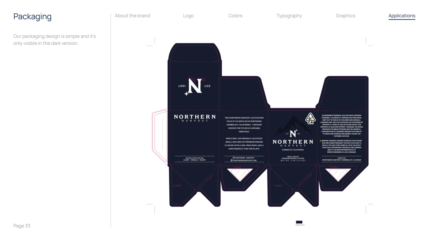
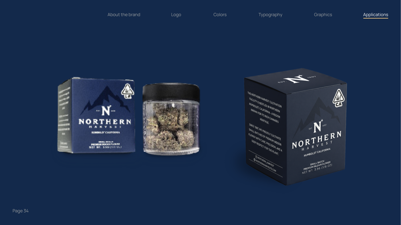
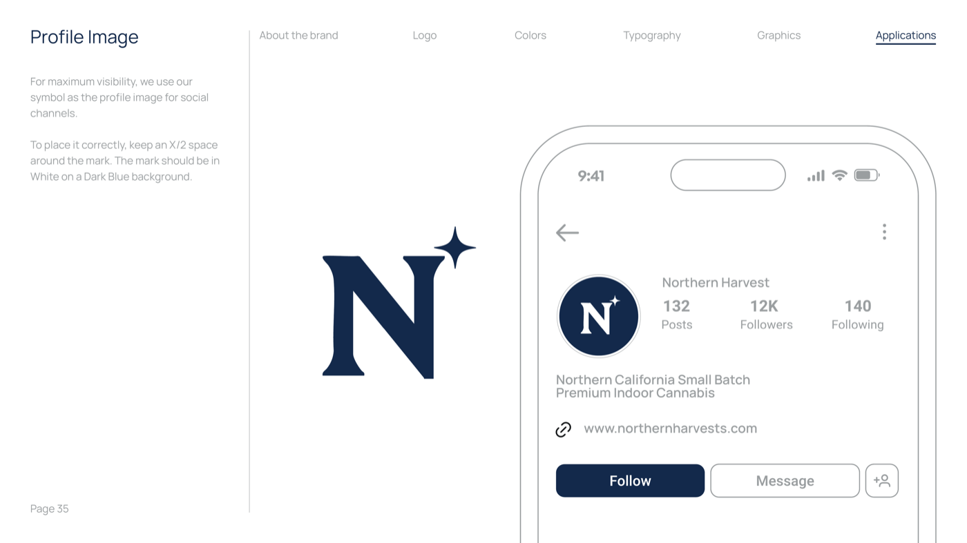
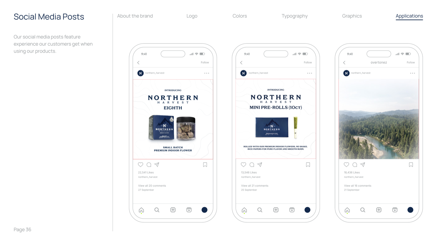
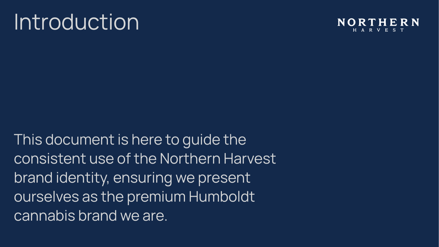
38-page brand guidelines document defining how Northern Harvest looks, speaks, and behaves. Typography, color, photography direction, packaging specs, and application rules. One system. Every touchpoint.

The brand system was designed to be understood by anyone who touches the brand, not just designers. Sales reps, distributors, retail partners. The guidelines read like a story about the brand.
Brand Guidelines 01 Brand Guidelines 02 Brand Guidelines 03 Brand Guidelines 04 Brand Guidelines 05 Brand Guidelines 06 Brand Guidelines 07 Brand Guidelines 08 Brand Guidelines 09 Brand Guidelines 10 Brand Guidelines 11 Brand Guidelines 12 Brand Guidelines 13 Brand Guidelines 14 Brand Guidelines 15 Brand Guidelines 16 Brand Guidelines 17 Brand Guidelines 18 Brand Guidelines 19 Brand Guidelines 20 Brand Guidelines 21 Brand Guidelines 22 Brand Guidelines 23 Brand Guidelines 24 Brand Guidelines 25 Brand Guidelines 26 Brand Guidelines 27 Brand Guidelines 28 Brand Guidelines 29 Brand Guidelines 30 Brand Guidelines 31 Brand Guidelines 32 Brand Guidelines 33 Brand Guidelines 34 Brand Guidelines 35 Brand Guidelines 36 Brand Guidelines 37 Brand Guidelines 38
Title: The Website
The Website

Multi-page production website with strain detail pages, product catalog, Humboldt story, and dispensary locator. Concept to deployed, directly in code. No mockups. No handoffs. No translation loss. What I designed is what went live.

I build in the browser instead of in a mockup file. On a four-month build that mattered more than usual, because the layouts were tested against real strain data from the first week. When the catalog changed, nothing had to be redrawn.

Website 01 Website 02 Website 03 Website 04 Website 05 Website 06 Website 07 Website 08

View live site: northernharvests.com

Title: Results
The Results
Six Systems. Four Months.
+30%
Distributor raised its projection after the first deliverables
250+
Dispensaries armed with branded sales tools for the first time
0 to 1
Complete brand system, now the distributor's reference standard
Before After
No brand guidelines 38-page brand system with typography, color, photography, and packaging specs
No sales collateral Menus, postcards, sell sheets, and tent cards in 250+ dispensaries
No website Production website with strain pages, product catalog, and dispensary locator
No content pipeline Active content strategy with photography direction and seasonal campaigns
Distributor flagging brand gap Distributor now uses the materials as its benchmark with other clients
"The distributor now uses the Northern Harvest materials as its reference standard with other brands."
The brand's distributor
PQ #003 97 Characters
Photography
nh_3.5g_box_open.png
nh_3.5g_box_straight.png
nh_3.5g_jar_side.png
row3-a.png
row3-b.png
row3-c.png
row4-a.png
row4-b.png
gap-hero-v3.png
row2-a.png
row2-b.png
row2-c.png
Title: Reflection
What I Would Do Differently

With more time, I would have pushed for a professional photography shoot before building the website. The product deserves it. What surprised me is how much the Million Dollar Test simplified decision-making. One filter eliminated hours of debate. When every stakeholder is aligned on a single question, the work moves faster than any process framework.

The project is ongoing and the brand is still evolving. The foundation is built.

Evan Roberts
Evan Roberts
Lead Designer, Roberts Design Studio
Roberts Design Studio is an American design company specializing in brand, package, digital, and web design.Make It Real