
 make it real.
Molly Powers is a writer in Brooklyn. She runs a Substack called K, "a coming-of-age publication for the stickers on my laptop," and has spent two years publishing on music, fashion, identity, and a dated series she calls Field Notes.
The default move for a writer is a Linktree with a serif font. Competent, and scrolled past in four seconds. The second-easiest move is a portfolio that lists her essays and sends every click straight back to Substack.
So the brief was a bet, set before the first screen. Build a site that reads the way she writes. Her voice in the type. Her rhythm in the scroll.
With no logo and no photography to hide behind, the typeface is the identity. The face had to carry long-form reading without fatigue and hold her voice at the same time, which means a true italic with real character.
The wordmark is her name built from a drifting field of her own initials that resolve into the words and dissolve back into texture as you move through the page. The mark is made of the reading.
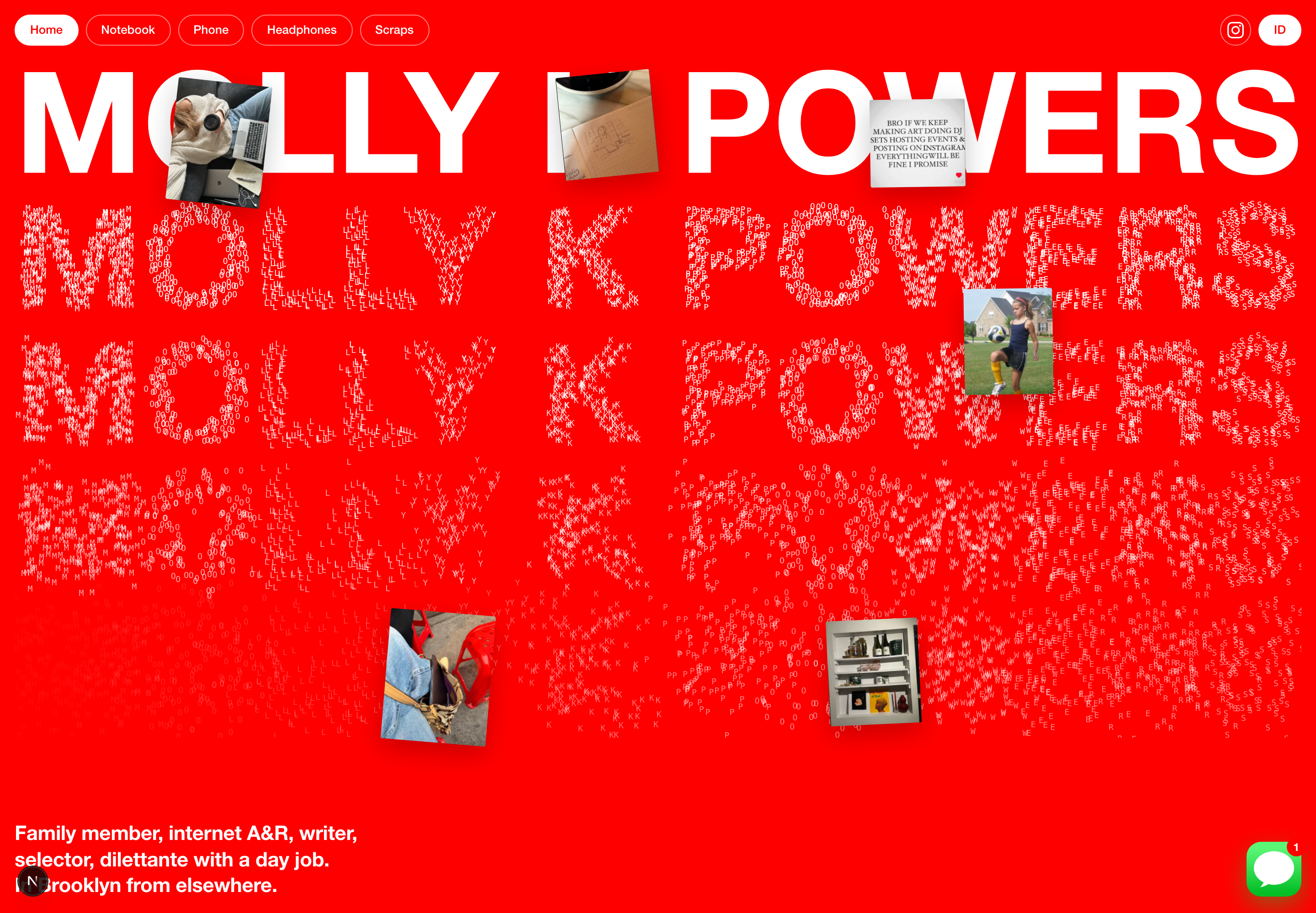
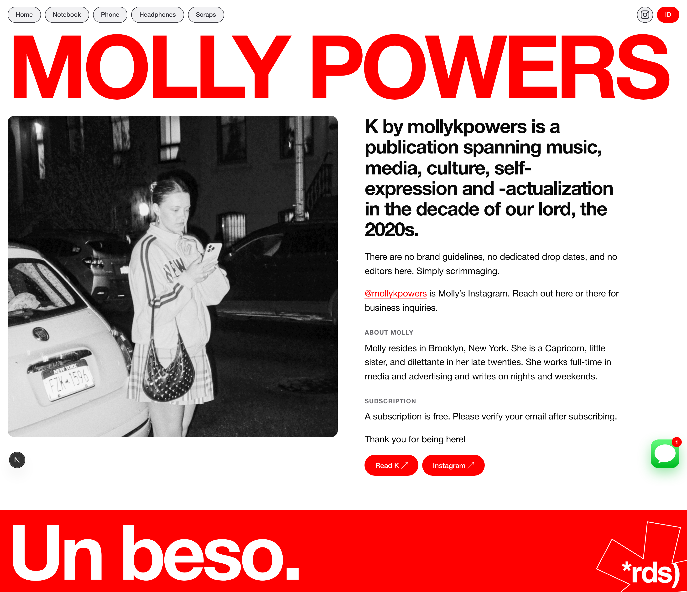
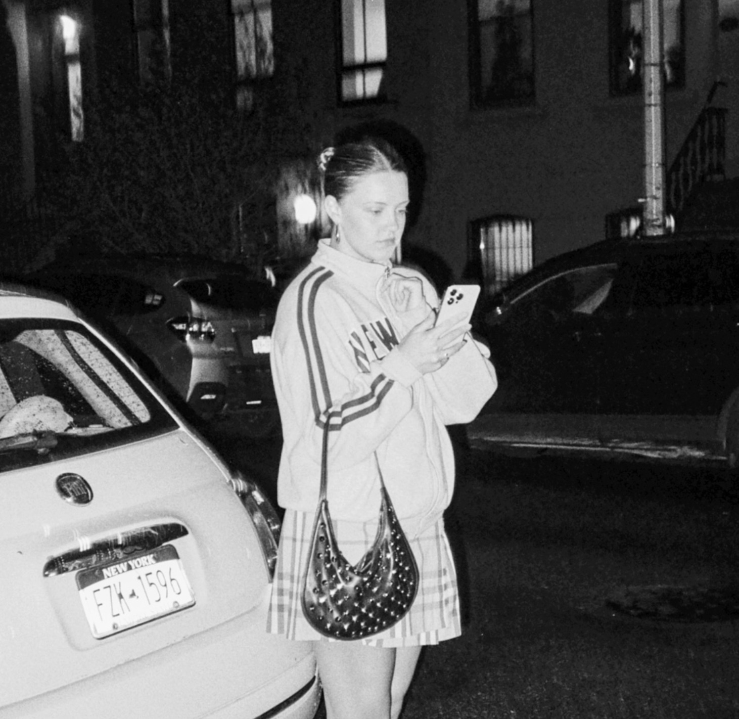

The whole site is built directly in code, in Next.js. The wordmark letter-field, the marginalia, the pacing of the scroll, all of it made in the medium it runs in.
Scroll pacing does not exist in a static file. I could only find the rhythm of this one by reading it the way a reader would, at real speed, on a real phone. That is the only place the site was ever going to be judged.
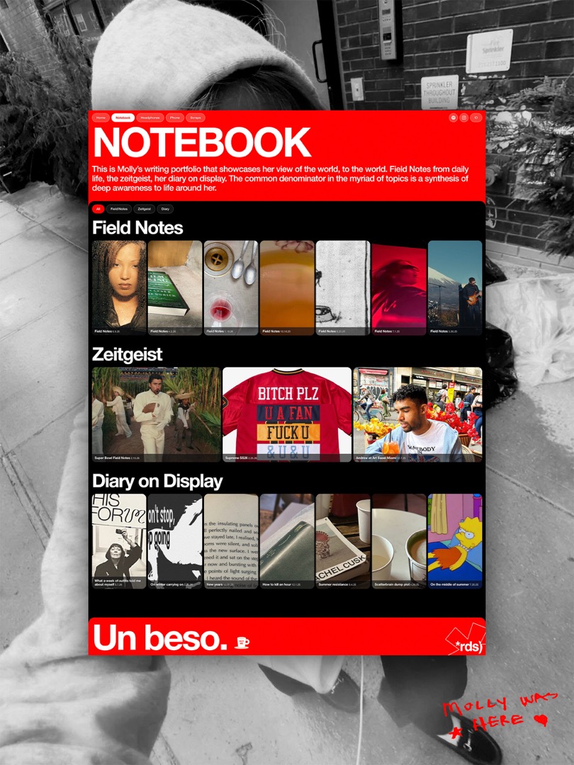
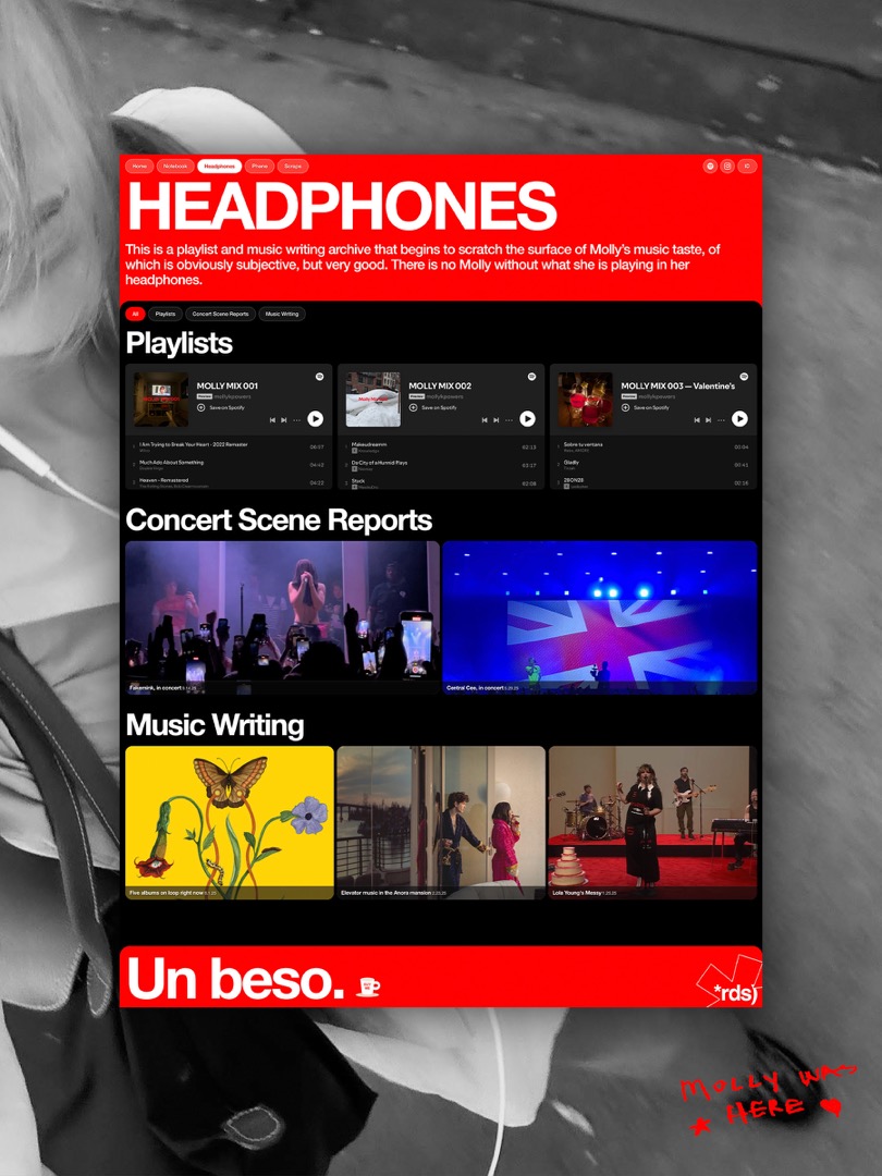
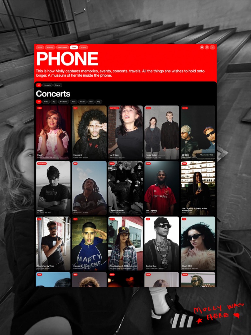
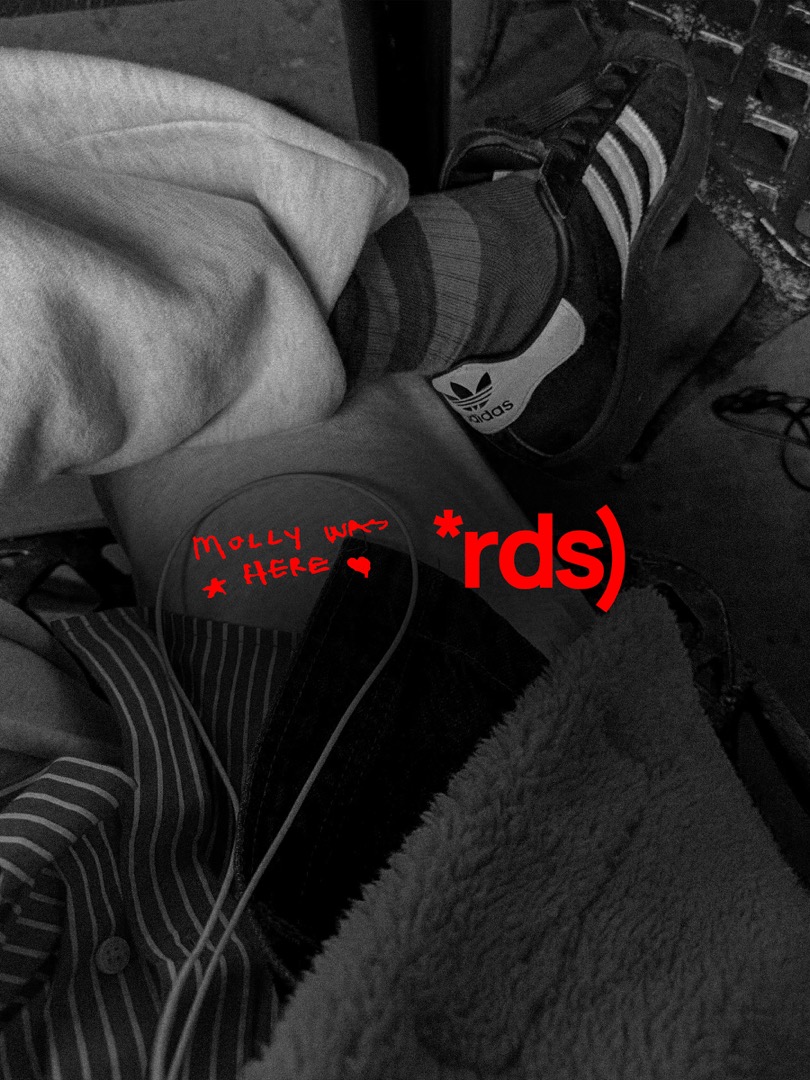
View live site: mollykpowers.com
| Before | After |
|---|---|
| A Linktree and a serif default | A face that holds long-form reading and her register at once |
| A list of essays with arrows out | A dated index that grows every time she publishes |
| Asides buried in a modal | The aside sits in the margin, at the height of the line it interrupts |
| A portfolio that describes her writing | A site that moves in the rhythm of her sentences |
| Every click sent to Substack | The essay ends and the next one is already there |
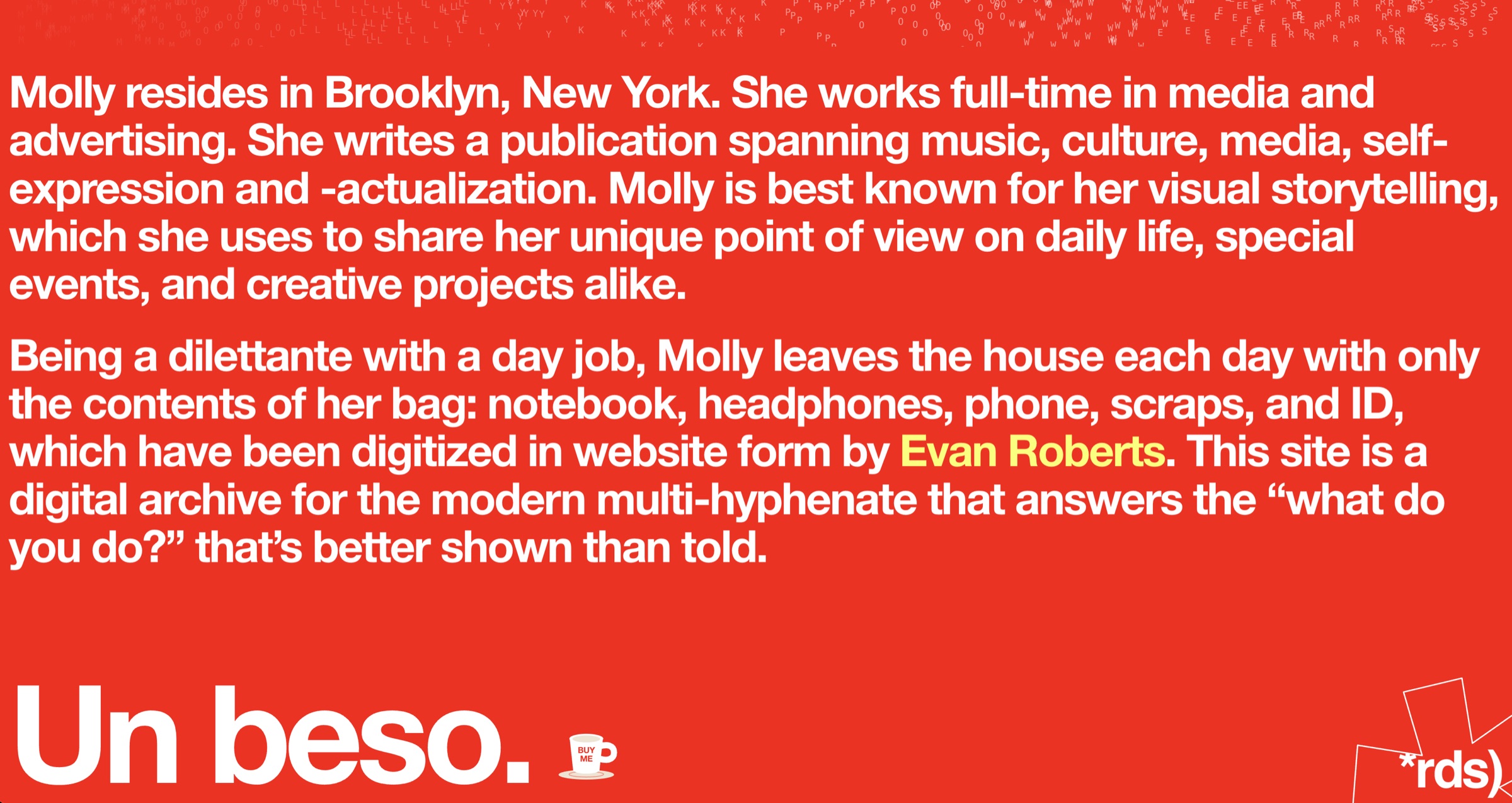
The hardest part was restraint. A writer's site tempts you toward gimmicks: cursor trails, noise shaders, five components at forty percent. The read on her work said the opposite. Two real things, fully made, and nothing else.
With more time I would build Field Notes into a living, dated index that grows every time she publishes, so the architecture keeps writing itself. But the bet held. Un beso.