A Church Full Of Non-Designers Needed A Brand That Designs Itself.
Client: Garden Church Scope: Brand System, Guidelines, Templates, Training, Web Industry: Faith
Evan Roberts
Evan Roberts
Lead Designer, Roberts Design Studio
make it real.
Title: The Rename
The Rename

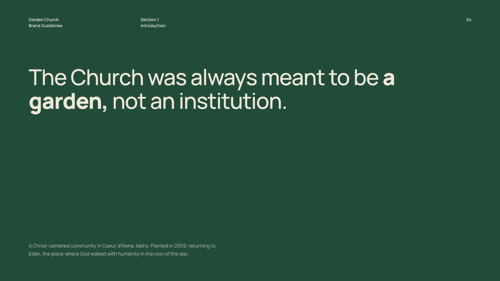
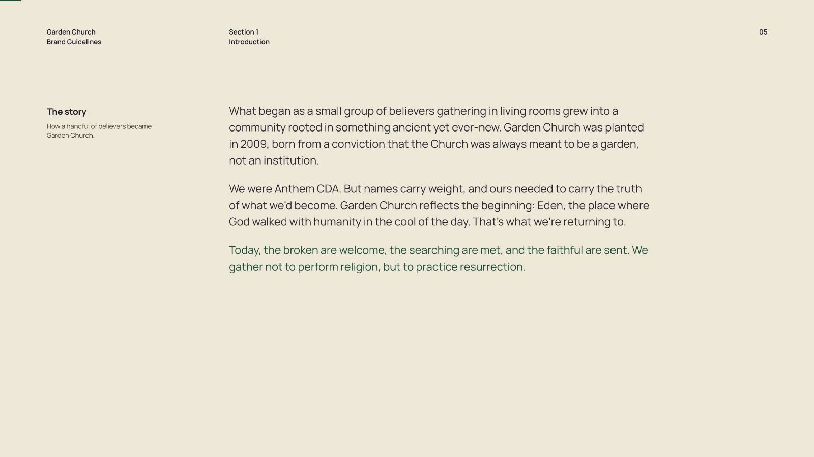
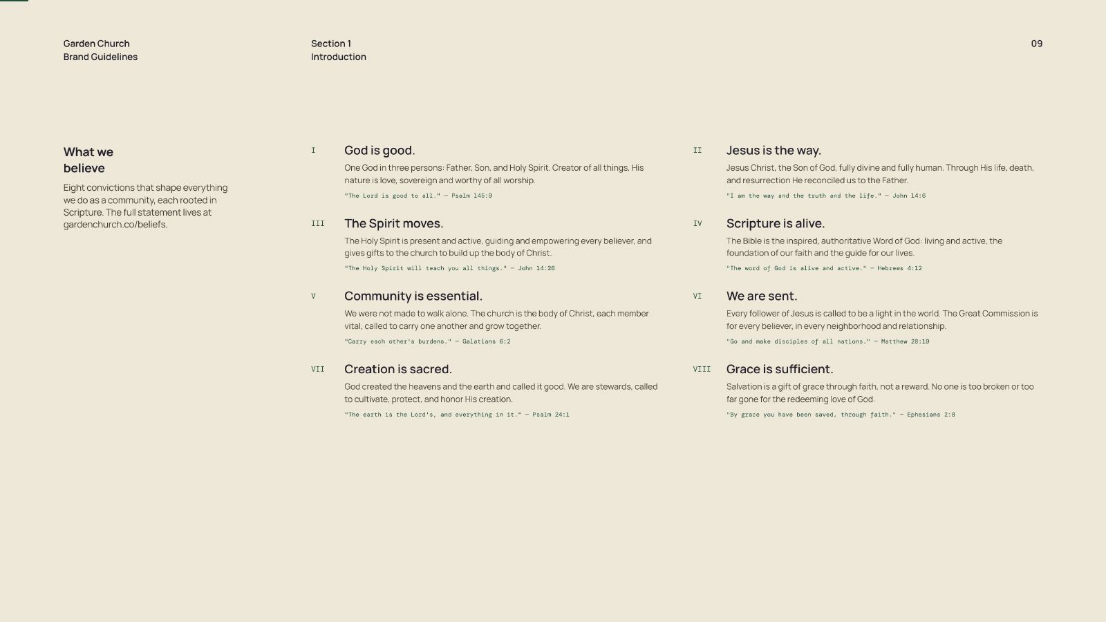
Garden Church was planted in 2009 as Anthem CDA. In 2026 it changed its name to match what it had actually become, and a name change is the moment every inconsistency in a brand becomes visible at once.

A church ships more design per week than most startups. Sunday slides, series artwork, event graphics, social posts, bulletins, signage, the site. None of it made by designers. All of it made on a deadline that does not move.

The staff did not need a designer. They needed to stop needing one.
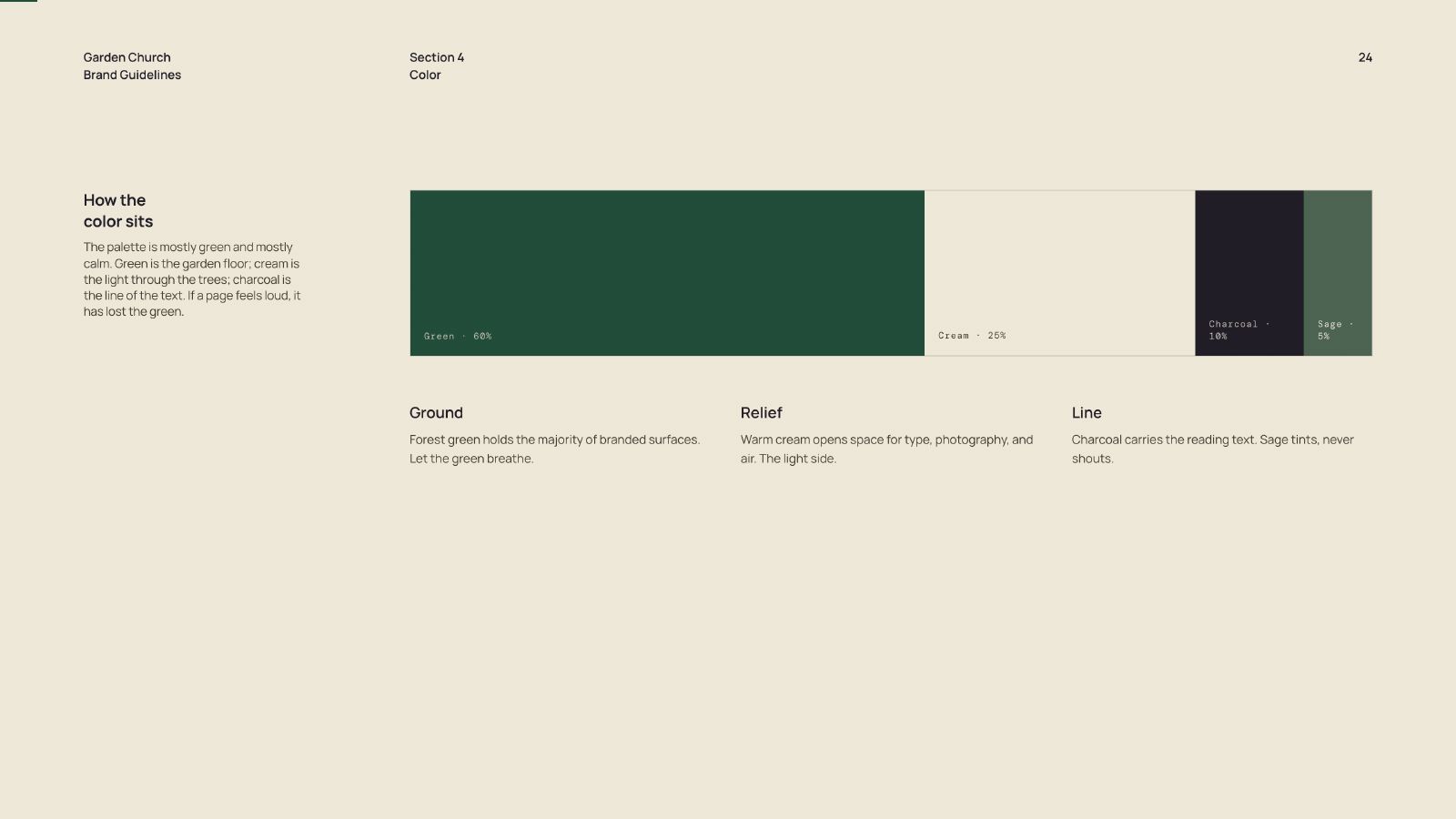
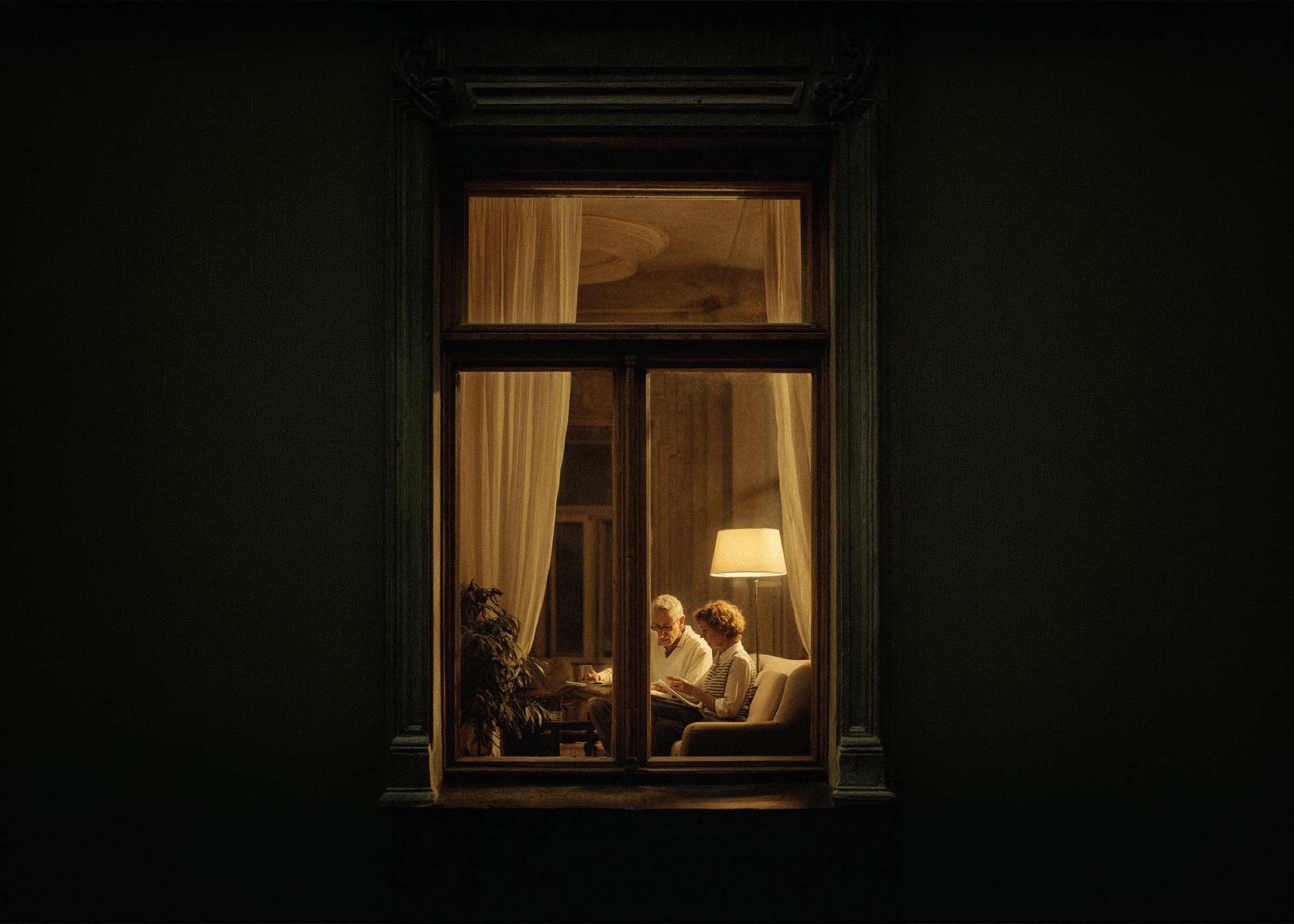
"Green is the garden floor. Cream is the light through the trees. If a page feels loud, it has lost the green."
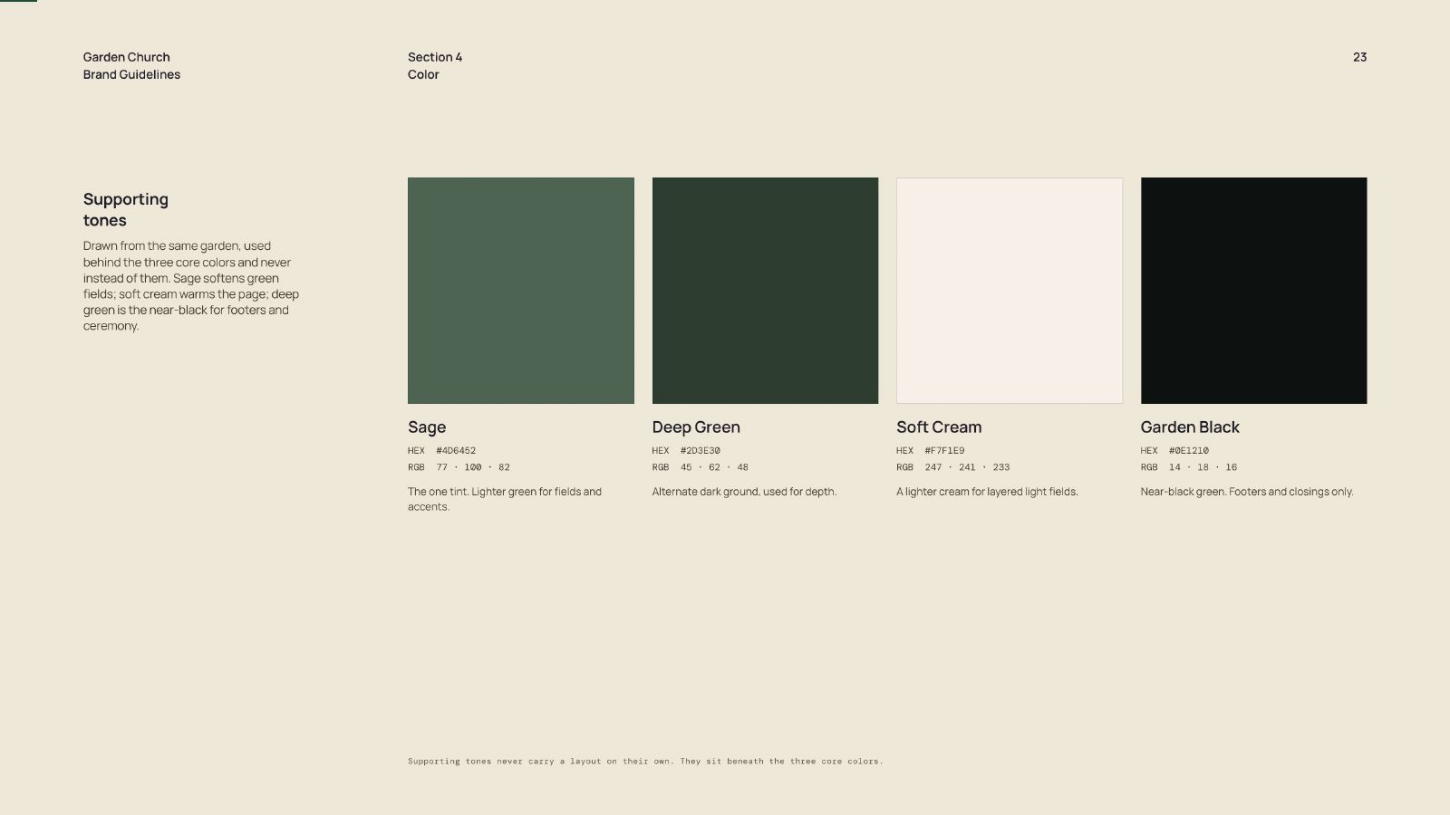
Brand Guidelines, Section 4, Color
PQ #001 103 Characters
OLD NAME MIXED LOGOS NO TEMPLATES NO GUIDELINES DRIFTING COLOR HALLWAY REQUESTS NO APPROVAL PATH NO PHOTO DIRECTION BLANK CANVAS VOLUNTEER GUESSWORK
90
Day retainer to build and hand over the whole system
39
Pages of brand guidelines across six sections
2
Domains served by one build, current and legacy

Every week a volunteer opened a blank canvas and made a decision a brand system should have already made for them. Every one of those decisions was a small drift away from the last.

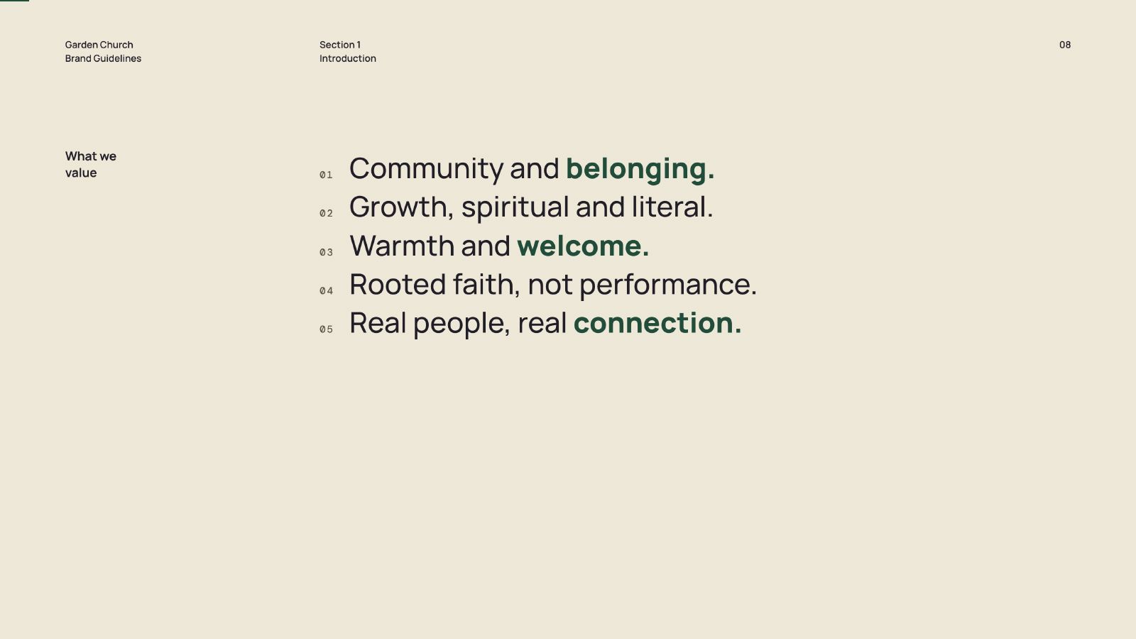
I was brought in for the rename and the brand system, but the actual brief underneath was operational: build something a team with no design training can run correctly on a Saturday night without asking anyone.

That reframes the deliverable. A logo is an asset. A system is a set of decisions already made.

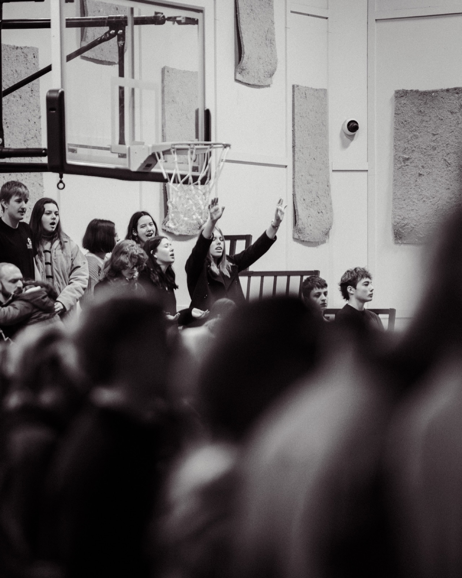
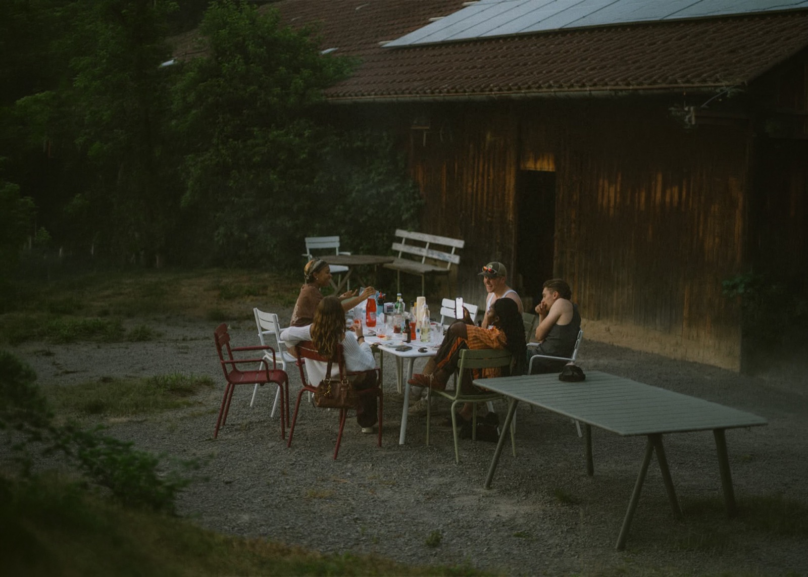
Garden Church gathering
community.jpg
Title: The Approach
The Approach

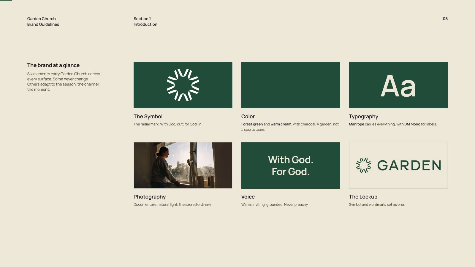
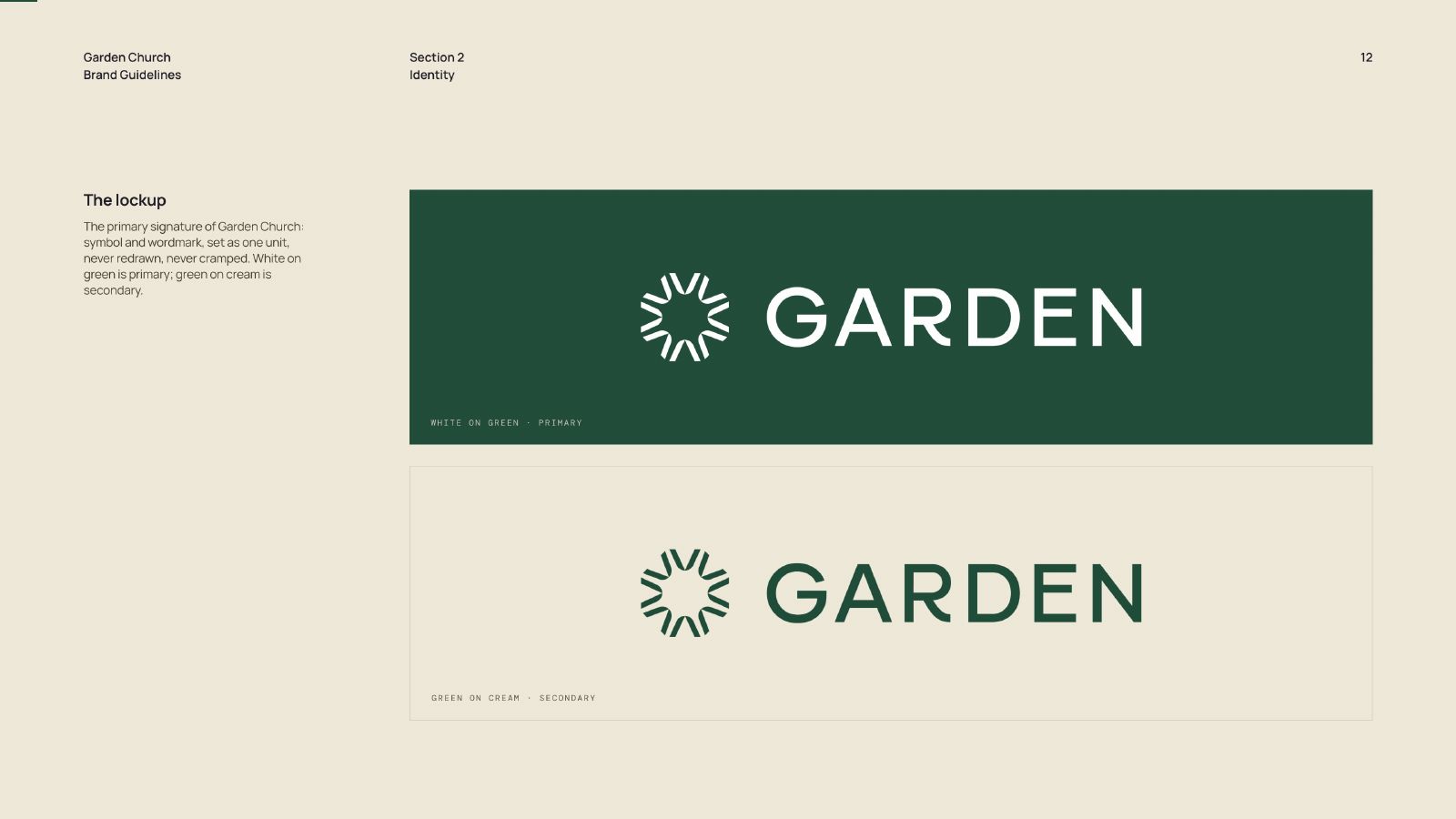
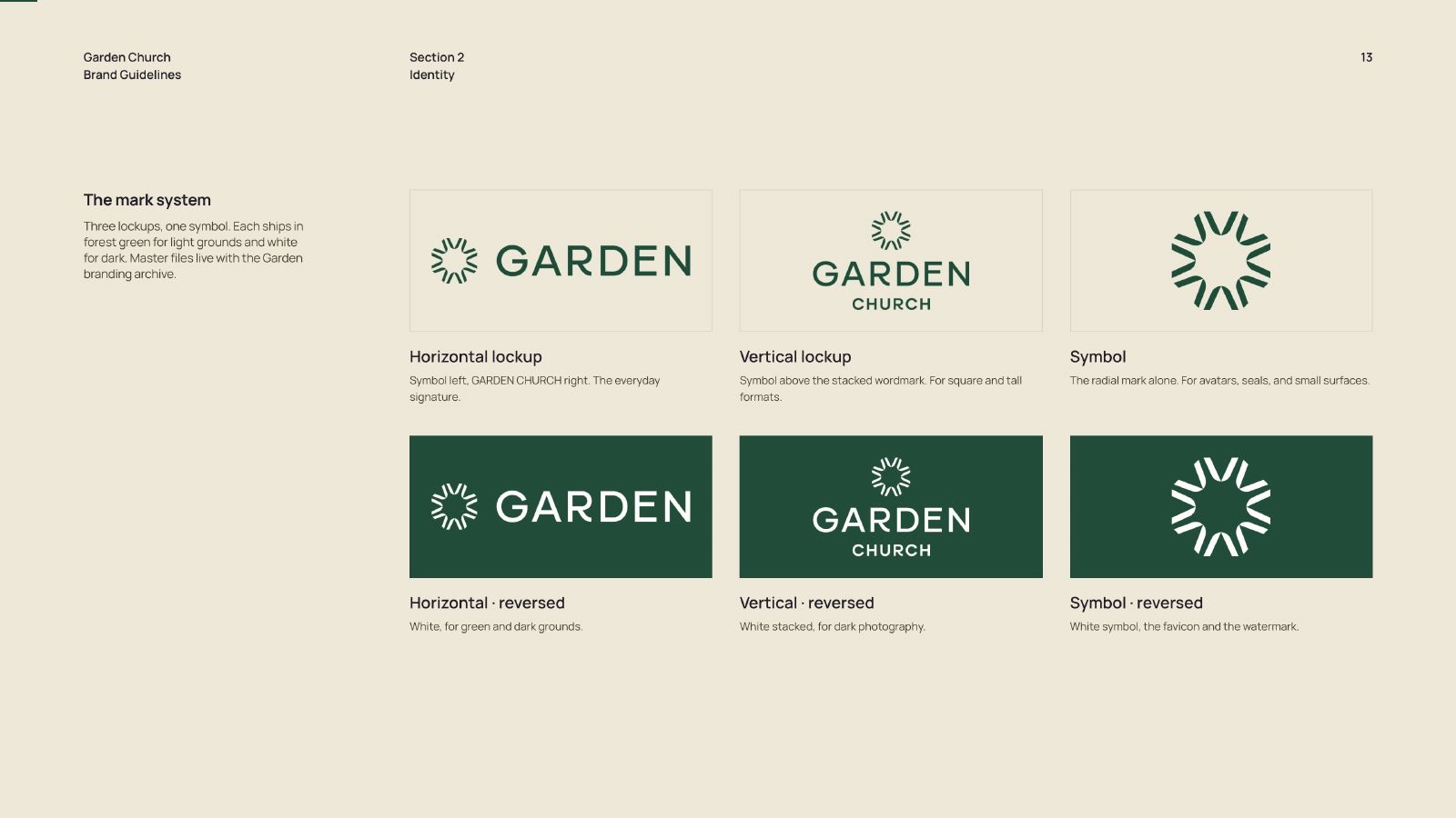
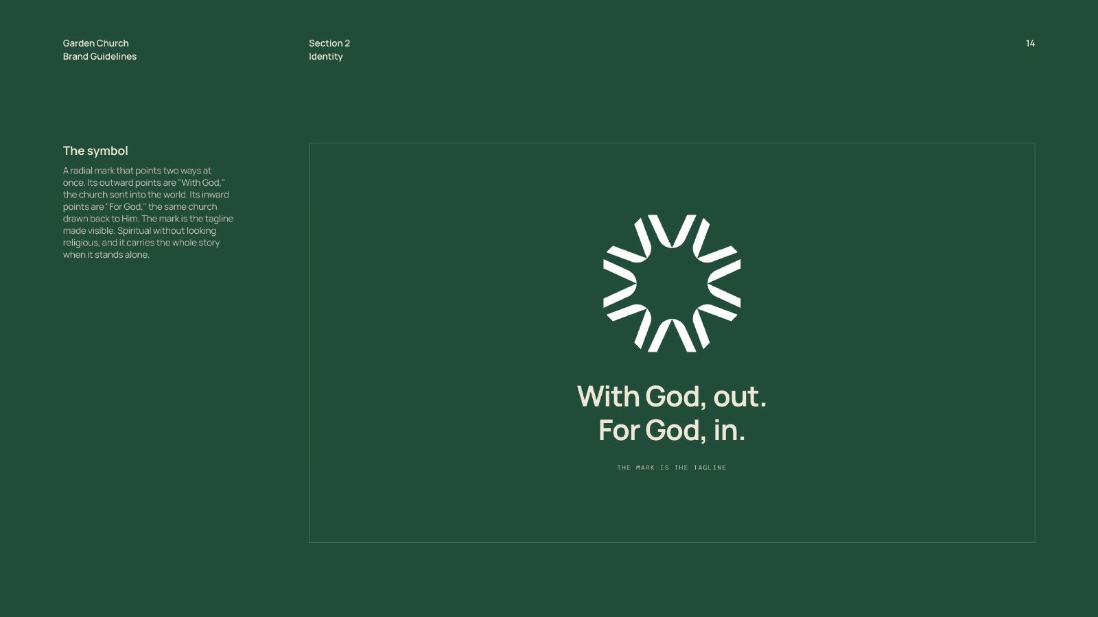
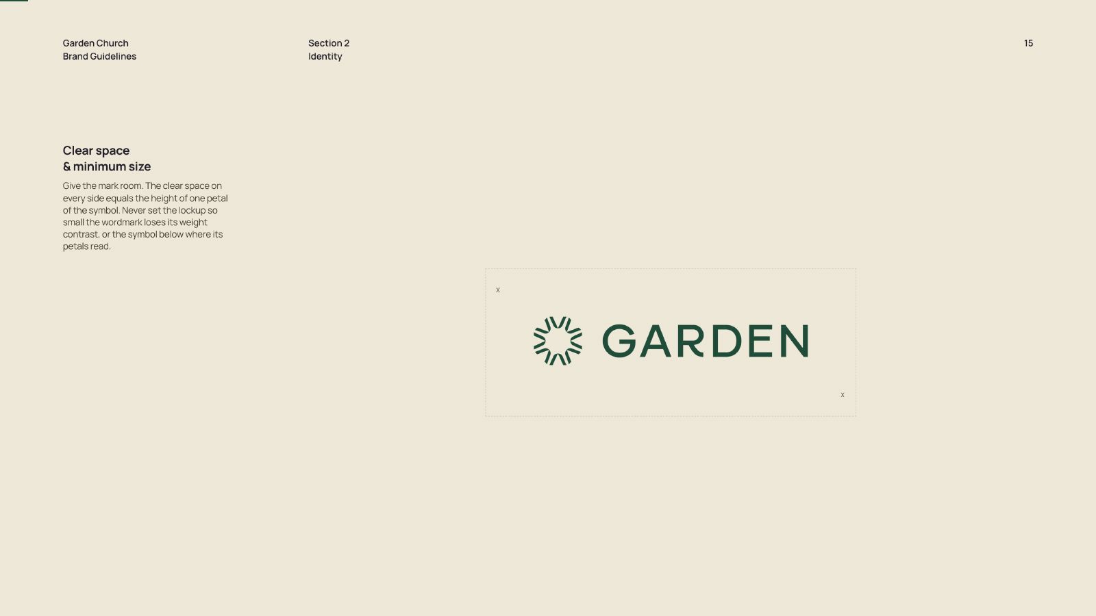
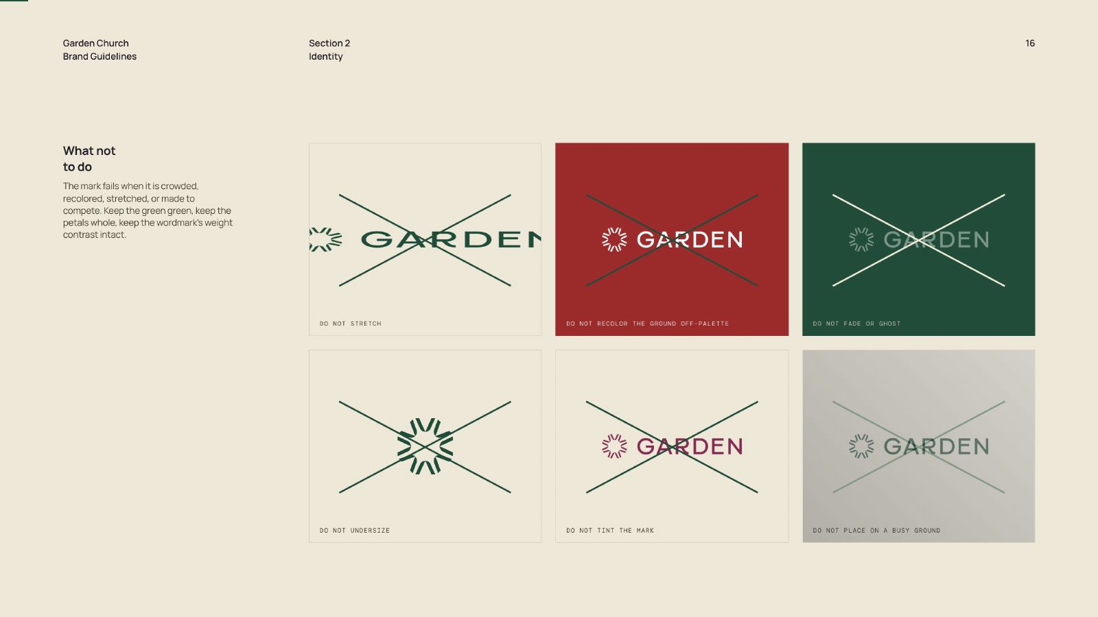
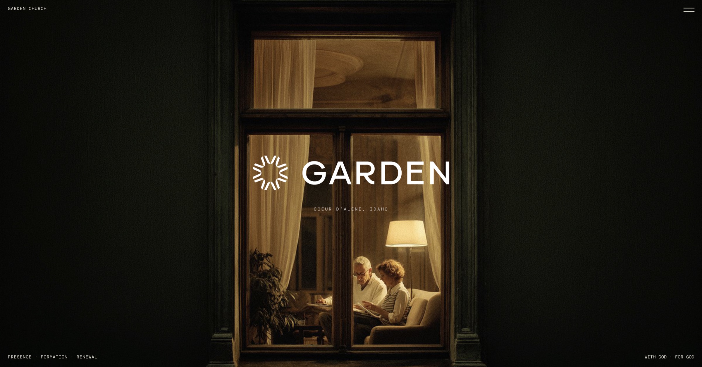
The identity is a nine-point symbol and a wide grotesque wordmark, locked as one unit, supplied white-on-green as primary and green-on-cream as secondary. It is never redrawn and never cramped.

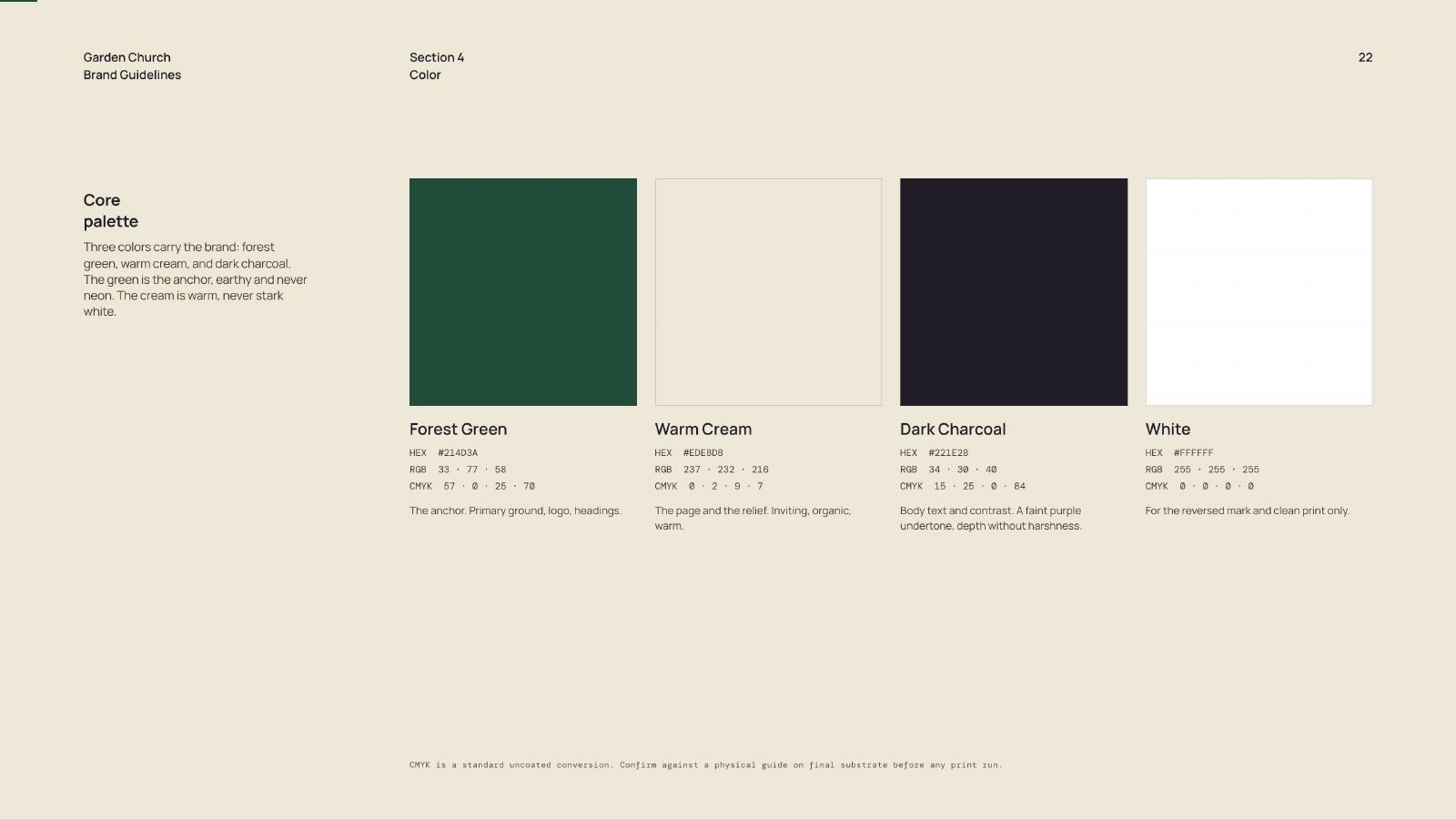
Forest green is the ground, warm cream is the relief, charcoal carries the reading text, and sage tints but never shouts. The proportions are specified as ratios rather than preferences: green holds roughly sixty percent of a branded surface, cream twenty-five, charcoal ten, sage five.

That ratio is the single most useful thing in the document, because it answers the question a volunteer actually has, which is not "what green" but "how much green."

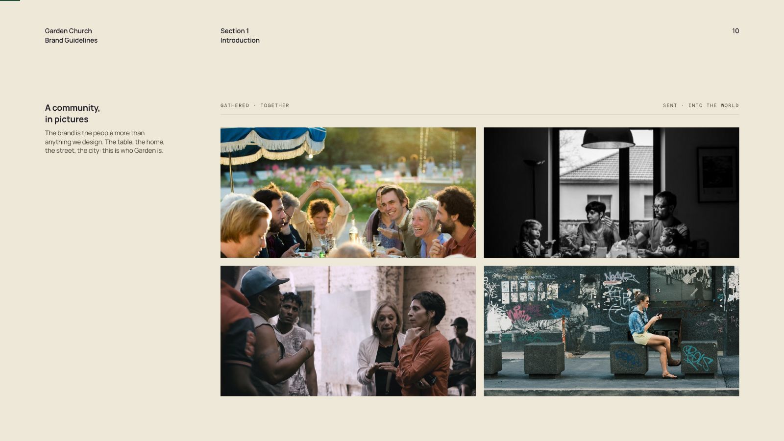
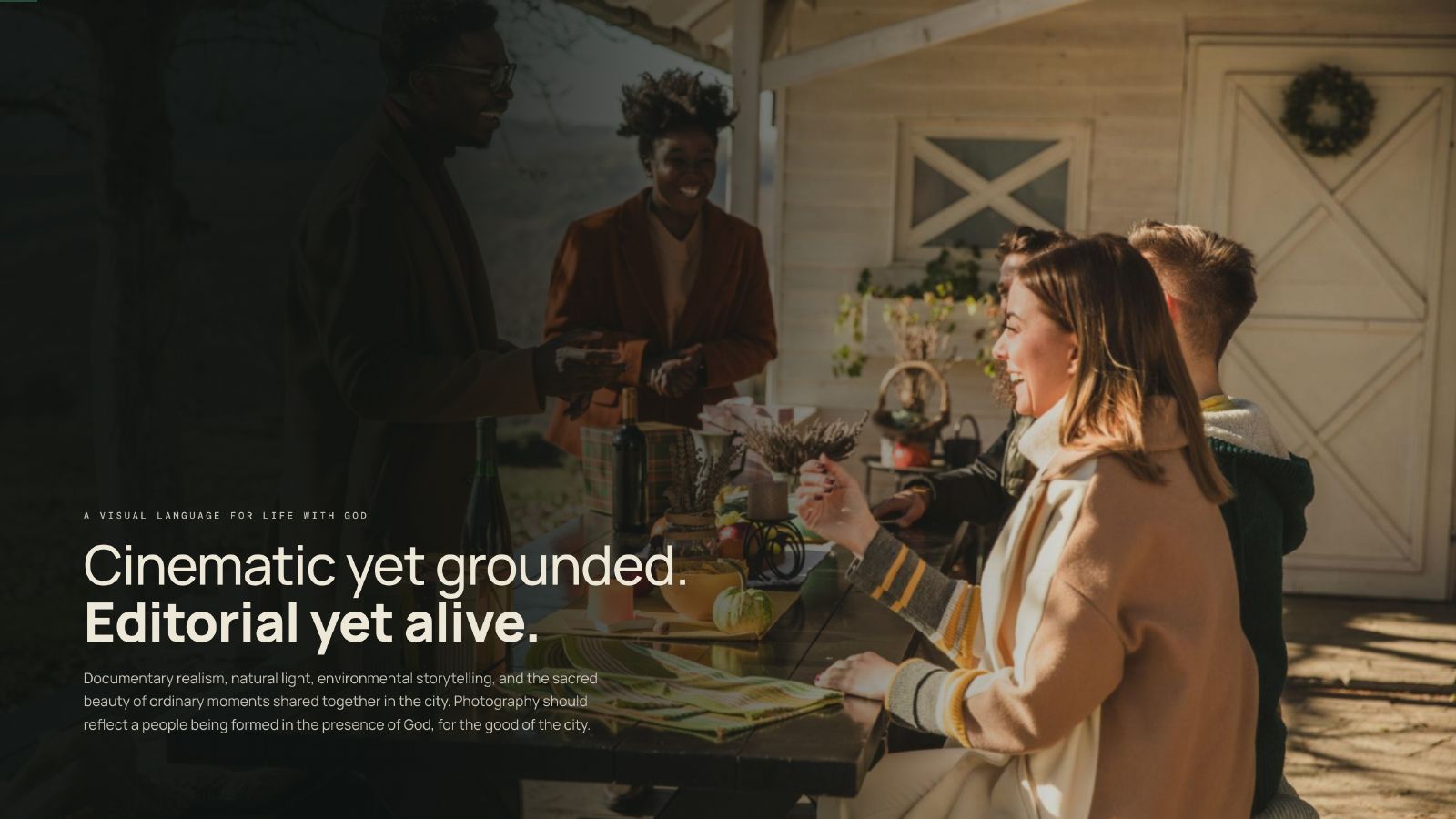
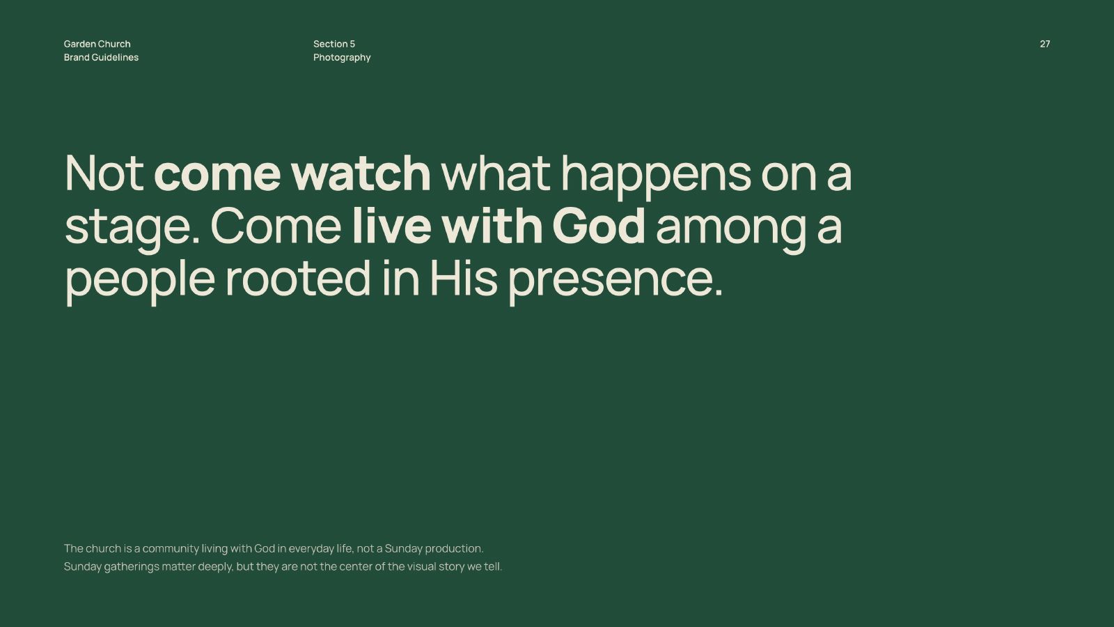
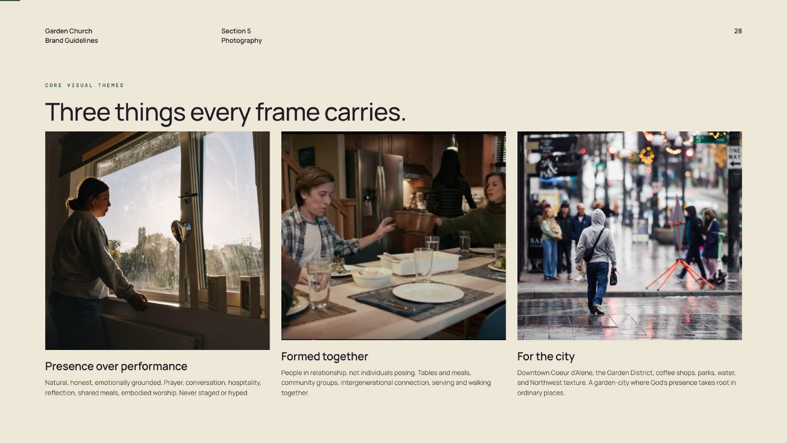
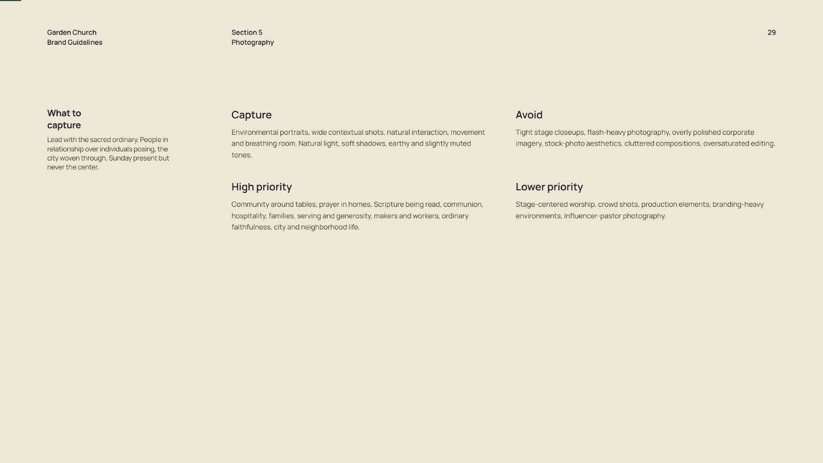
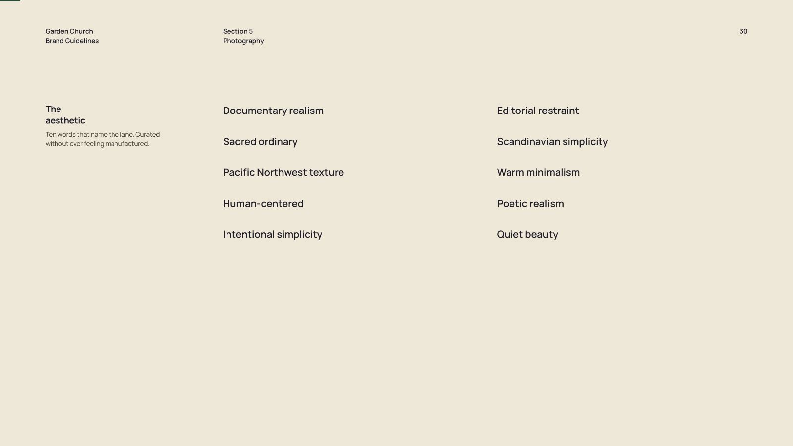
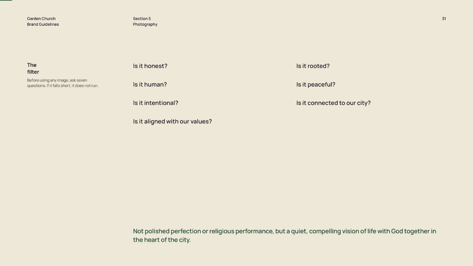
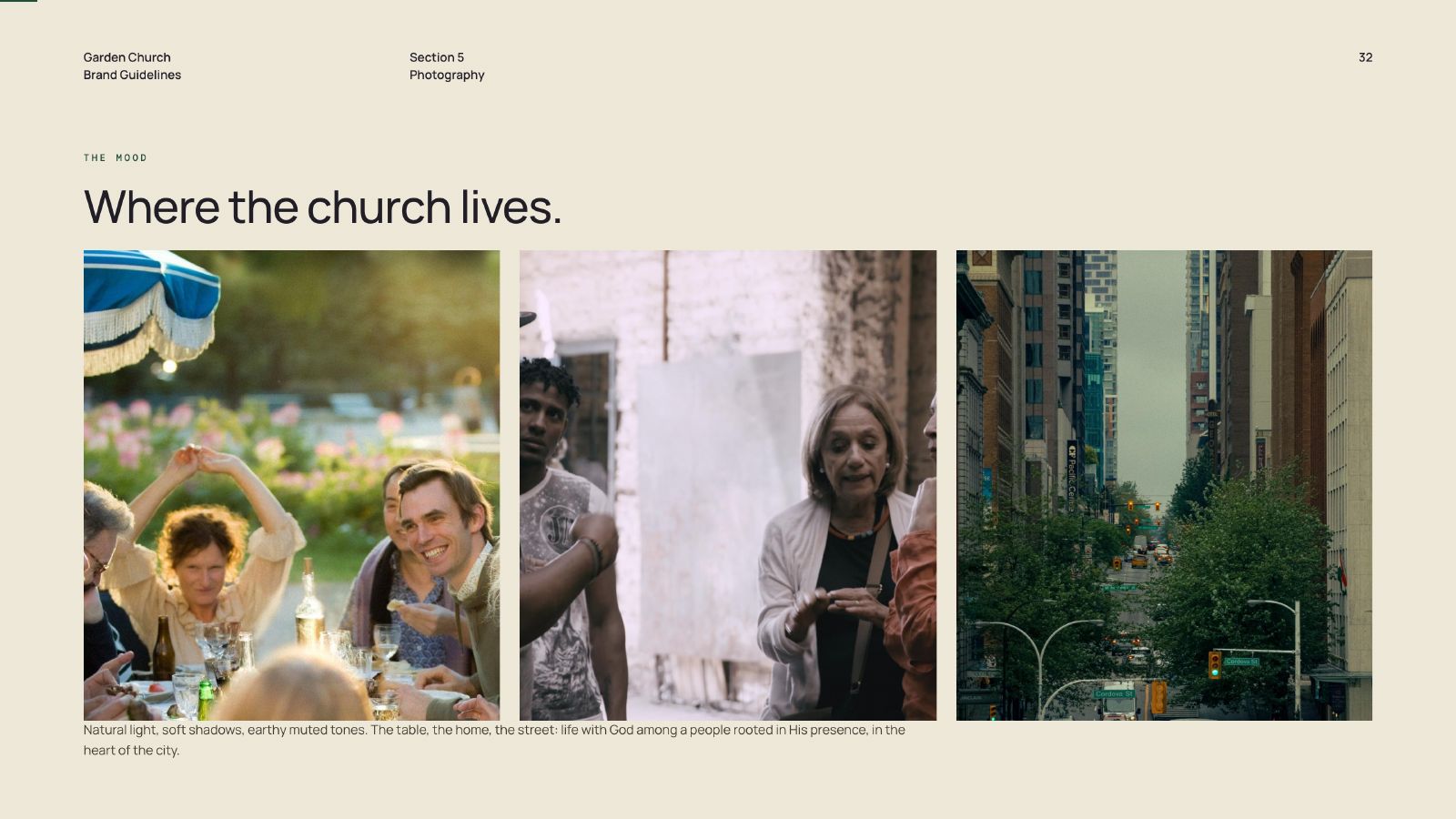
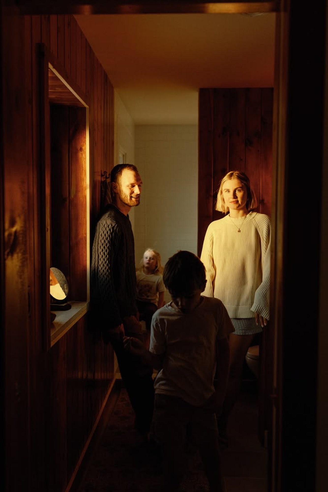
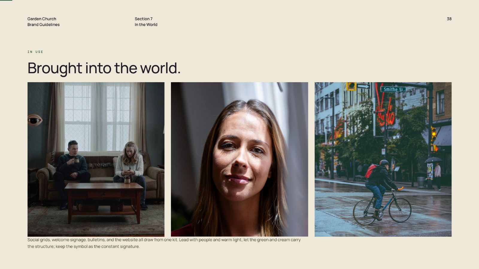
Photography is where church branding usually goes wrong: stage closeups, flash, crowd shots, production gear in frame. The direction here is the opposite. Lead with the sacred ordinary, people in relationship, natural light and breathing room.

Garden Church site, home
approach.jpg
"Guidelines nobody follows are decoration."
Evan Roberts, Lead Designer
PQ #002 The Operational Brief 40 Characters
Key Decisions
Decision Outcome
Rules written as sentences, not swatches A volunteer gets an answer to how much green, not a list of hex values to interpret.
Colour specified as surface proportion Sixty, twenty-five, ten, five decides a layout before anyone opens a file.
Template library over one-off requests The recurring weekly assets start from a correct file instead of a blank canvas.
One intake route, named decision owners Approval stopped being a committee, a hallway ask, and a group text.
Scope of Work
Jun 26 Jul 26 Aug 26 Sep 26 Oct 26
Rename & Direction 3 wk
Identity System 4 wk
Guidelines 6 wk
Template Library 4 wk
Website 5 wk
Training & Handoff 2 wk
Title: Brand System
The System

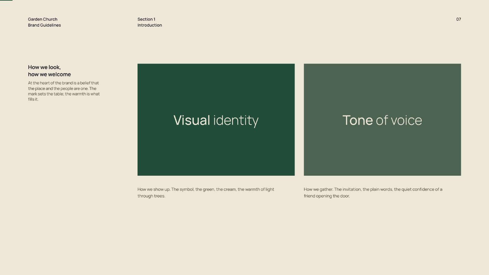
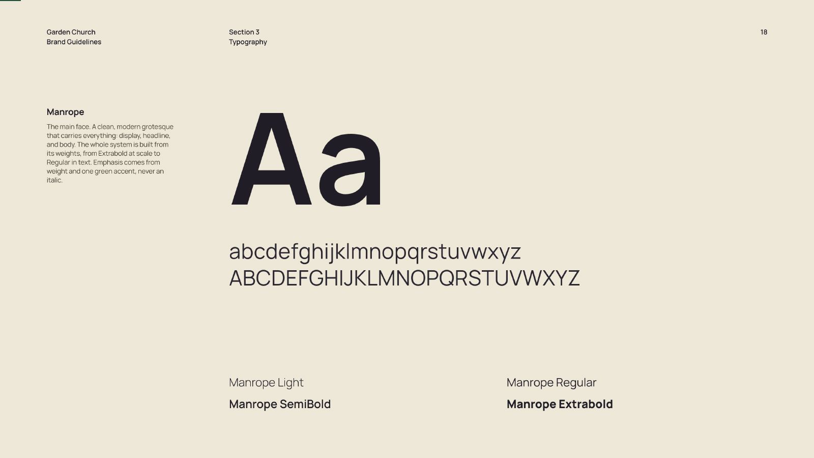
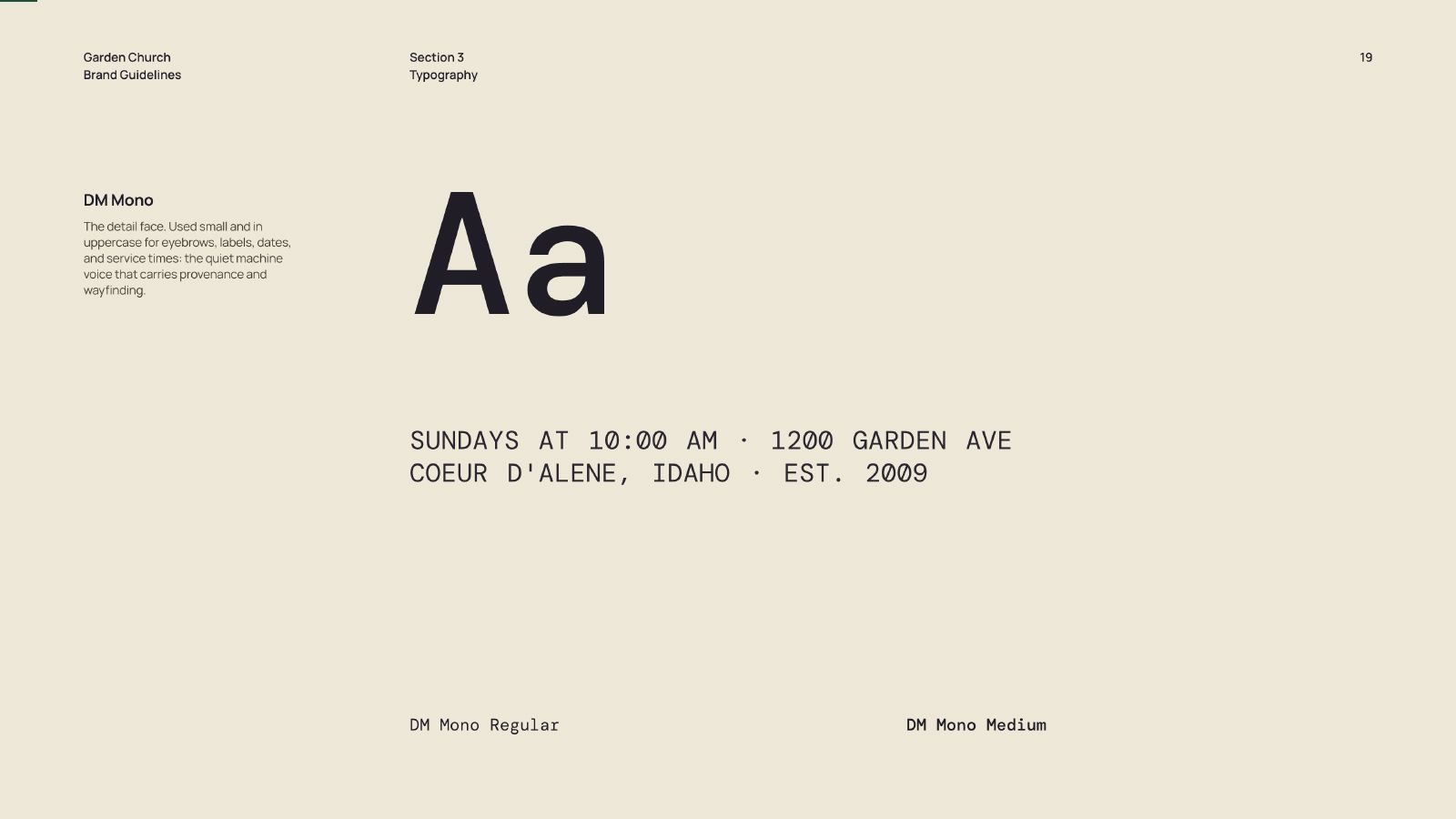
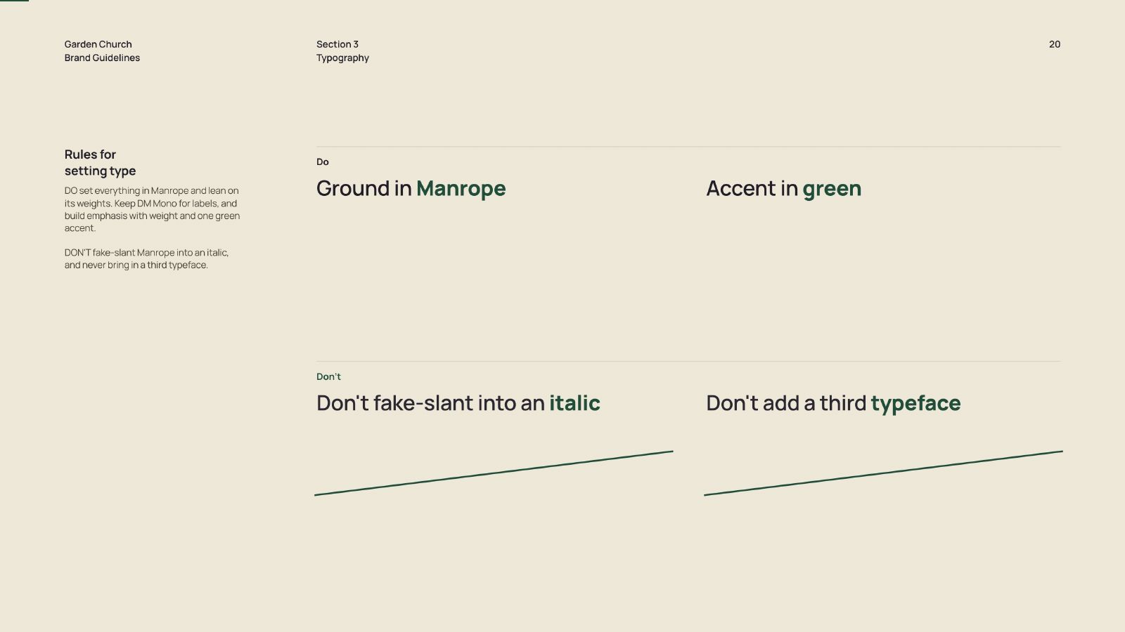
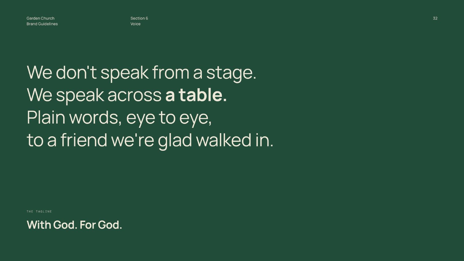
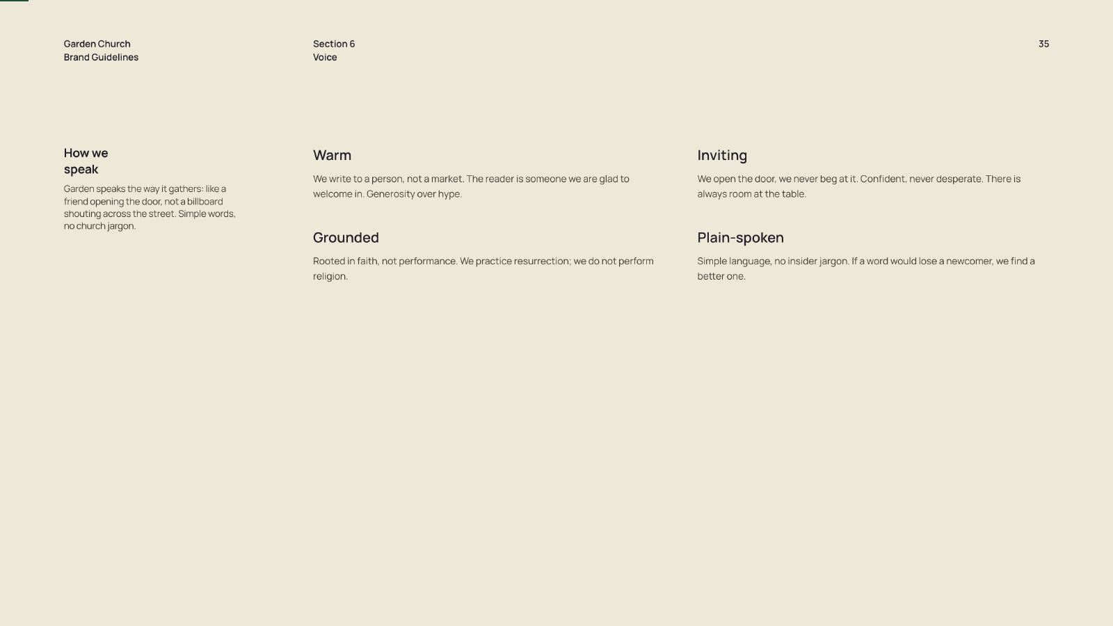
Thirty-nine pages across six sections: story, identity, typography, colour, photography, and voice. The document specifies proportion and sequence rather than preference.

It is written to be read by people who were never trained as designers. Photography direction names the high-priority subjects and, more usefully, the low-priority ones. Telling a volunteer what not to shoot is worth more than telling them what to shoot.

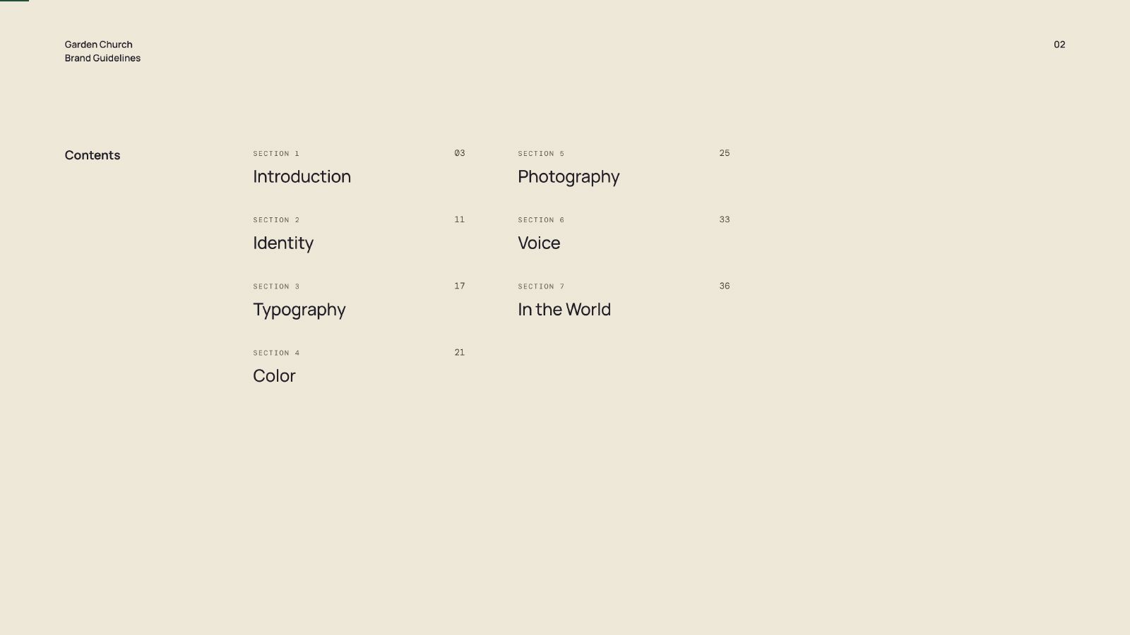
Brand Guidelines 01 Brand Guidelines 02 Brand Guidelines 03 Brand Guidelines 04 Brand Guidelines 05 Brand Guidelines 06 Brand Guidelines 07 Brand Guidelines 08 Brand Guidelines 09 Brand Guidelines 10 Brand Guidelines 11 Brand Guidelines 12 Brand Guidelines 13 Brand Guidelines 14 Brand Guidelines 15 Brand Guidelines 16 Brand Guidelines 17 Brand Guidelines 18 Brand Guidelines 19 Brand Guidelines 20 Brand Guidelines 21 Brand Guidelines 22 Brand Guidelines 23 Brand Guidelines 24 Brand Guidelines 25 Brand Guidelines 26 Brand Guidelines 27 Brand Guidelines 28 Brand Guidelines 29 Brand Guidelines 30 Brand Guidelines 31 Brand Guidelines 32 Brand Guidelines 33 Brand Guidelines 34 Brand Guidelines 35 Brand Guidelines 36 Brand Guidelines 37 Brand Guidelines 38 Brand Guidelines 39
Title: The Website
The Website

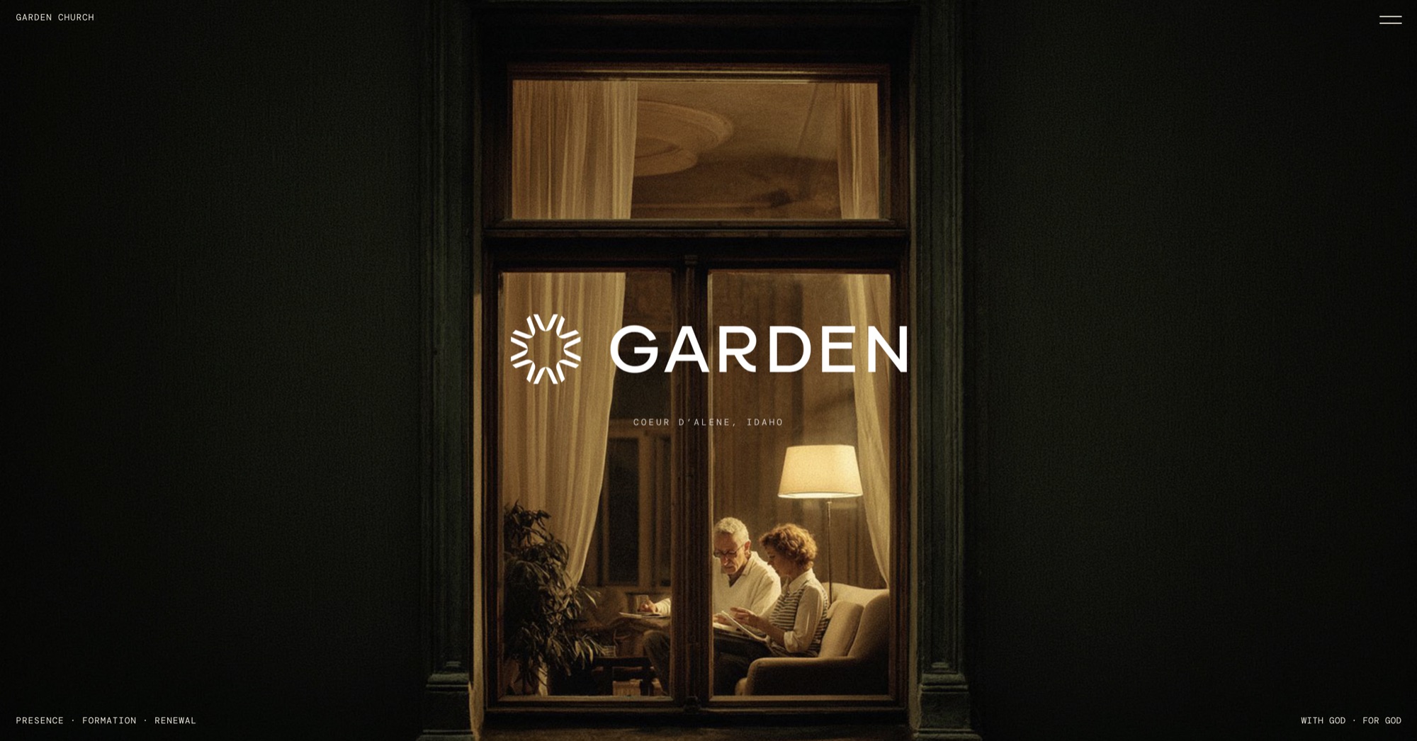
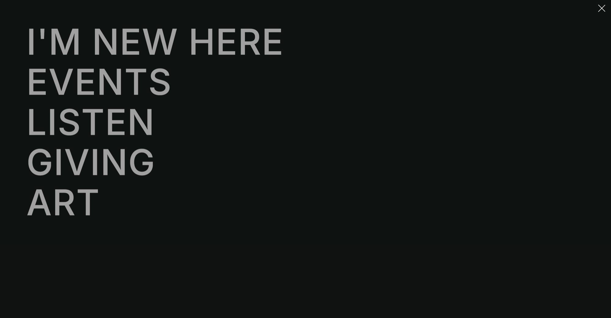
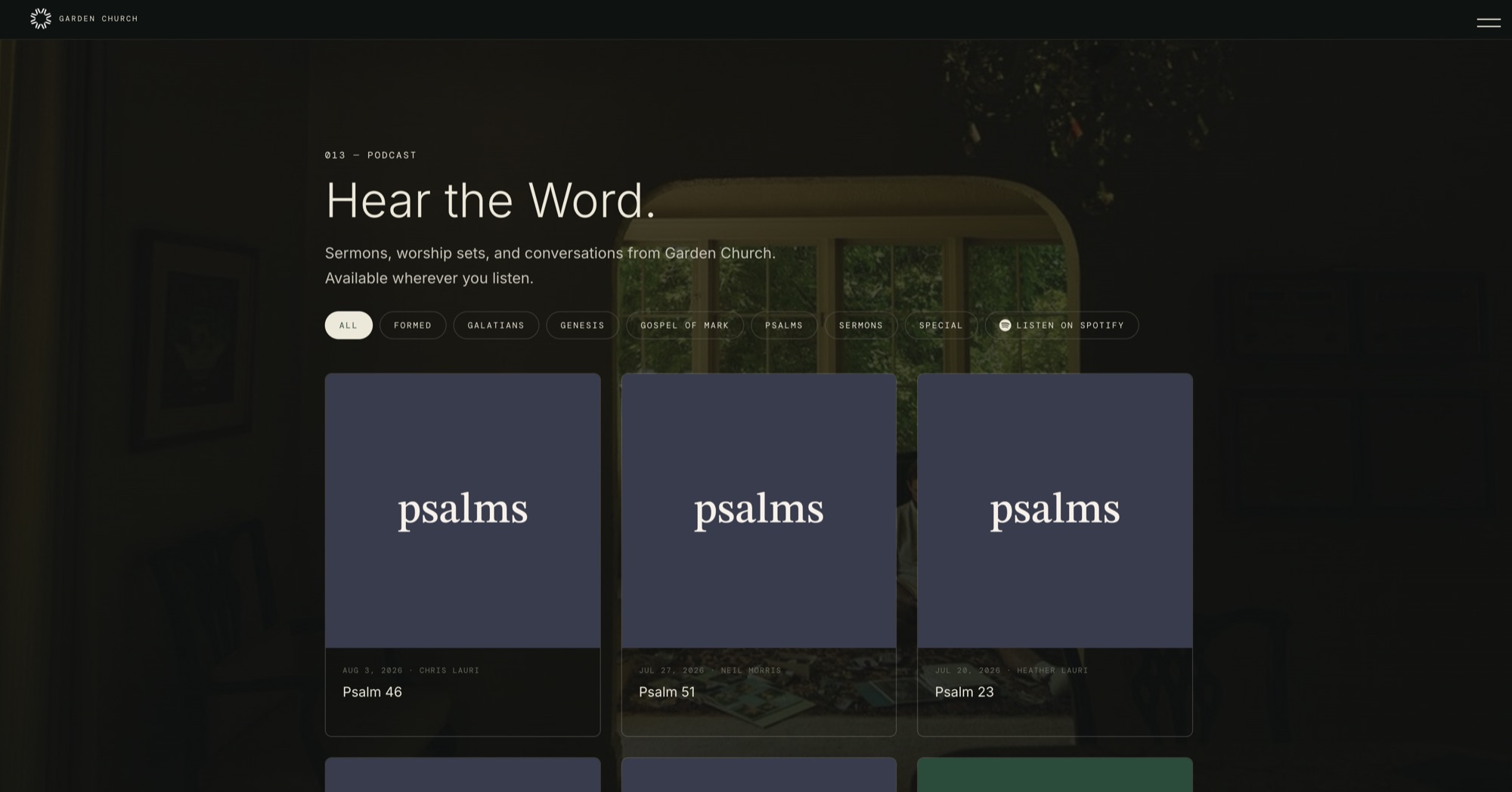
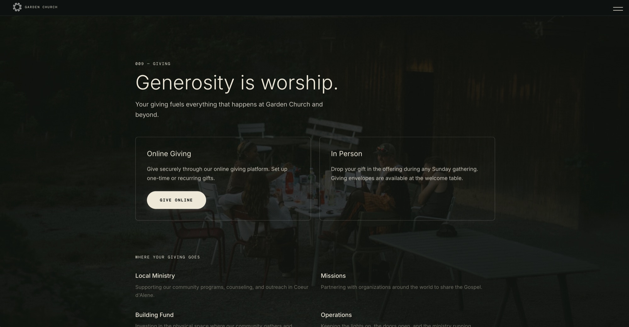
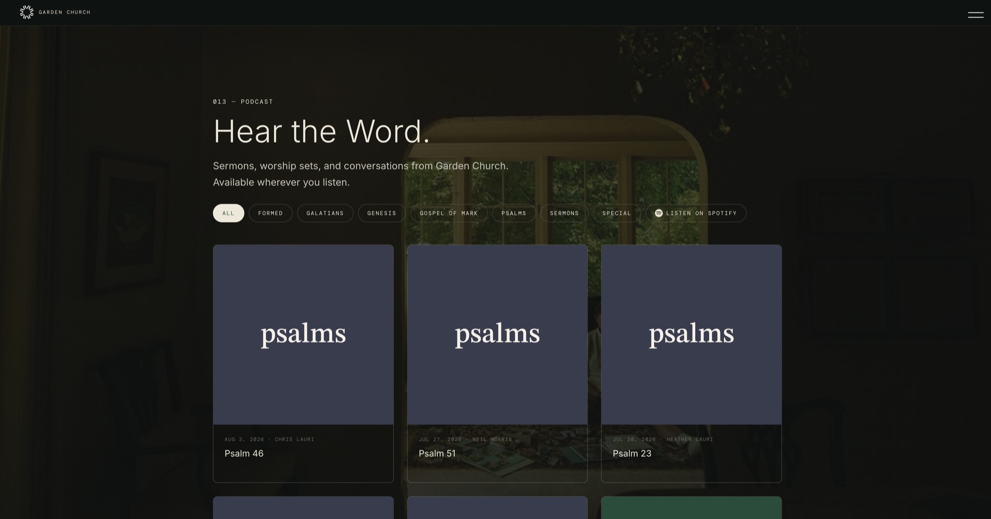
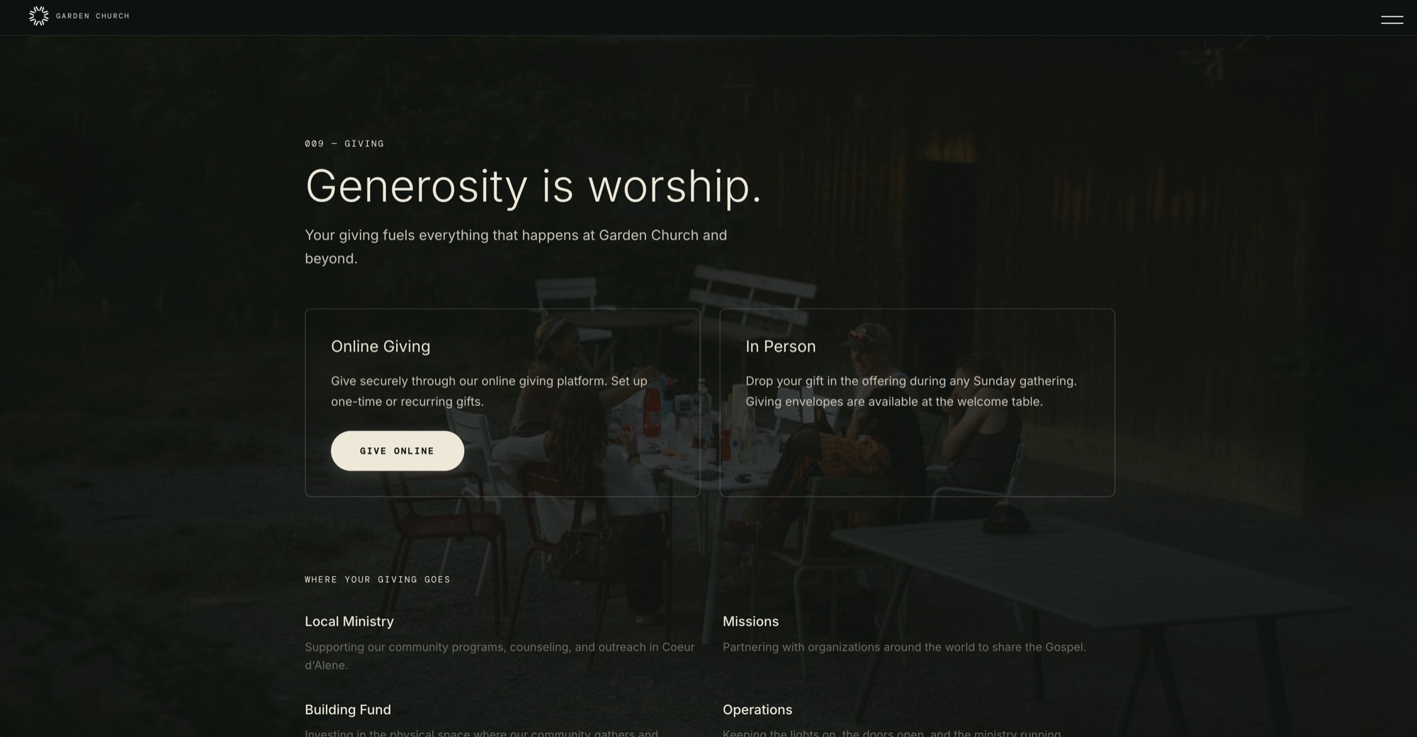
Built and shipped directly in code, serving both the current and the legacy domain so nobody arrives at a dead link after the rename. No mockups. No handoffs. What I designed is what shipped.

This is what I call Direct Design. Build directly in the medium. The browser is the canvas. The feedback loop collapses from weeks to minutes. Every decision is tested against real constraints, real content, real devices. Not a simulation of a website. The website.

Website 01 Website 02 Website 03 Website 04

View live site: gardencda.com

Title: Results
The Results
One System. Ninety Days.
39
Page brand book handed over across six sections
0
Designers needed to run a normal week
2
Domains served by a single build
Before After
Two names in circulation One lockup, supplied as a single unit, never redrawn
Colour chosen per asset Colour specified as surface proportion, sixty percent green
A blank canvas every Saturday night A template library covering the recurring weekly assets
Requests arriving as hallway asks One intake route with named decision owners
Stage-lit crowd photography Photography direction naming what to capture and what to avoid
"The measure is whether it still looks like itself six months later, made by people who were never trained as designers."
Garden Church, Handover
PQ #003 119 Characters
Photography
hero.jpg
worship.jpg
approach.jpg
gc-03.jpg
gc-04.jpg
gc-05.jpg
Title: Reflection
What I Would Do Differently

With more time I would have run the training session twice, once before the guidelines were final and once after, because the questions people ask when they are actually making something are different from the questions they ask reading a document.
The brand book was half the work. The other half was operational, and that half is what decides whether any of it survives.
Evan Roberts
Evan Roberts
Lead Designer, Roberts Design Studio
Roberts Design Studio is an American design company specializing in brand, package, digital, and web design.Make It Real