A Rare Members-Only Tequila Collective Needed To Look Like One.
Client: Cienfuegos Scope: Identity, Packaging, Bottle Platform, Web Industry: Members-Only Tequila
Evan Roberts
Evan Roberts
Lead Designer, Roberts Design Studio
make it real.
Title: The Blur
The Blur

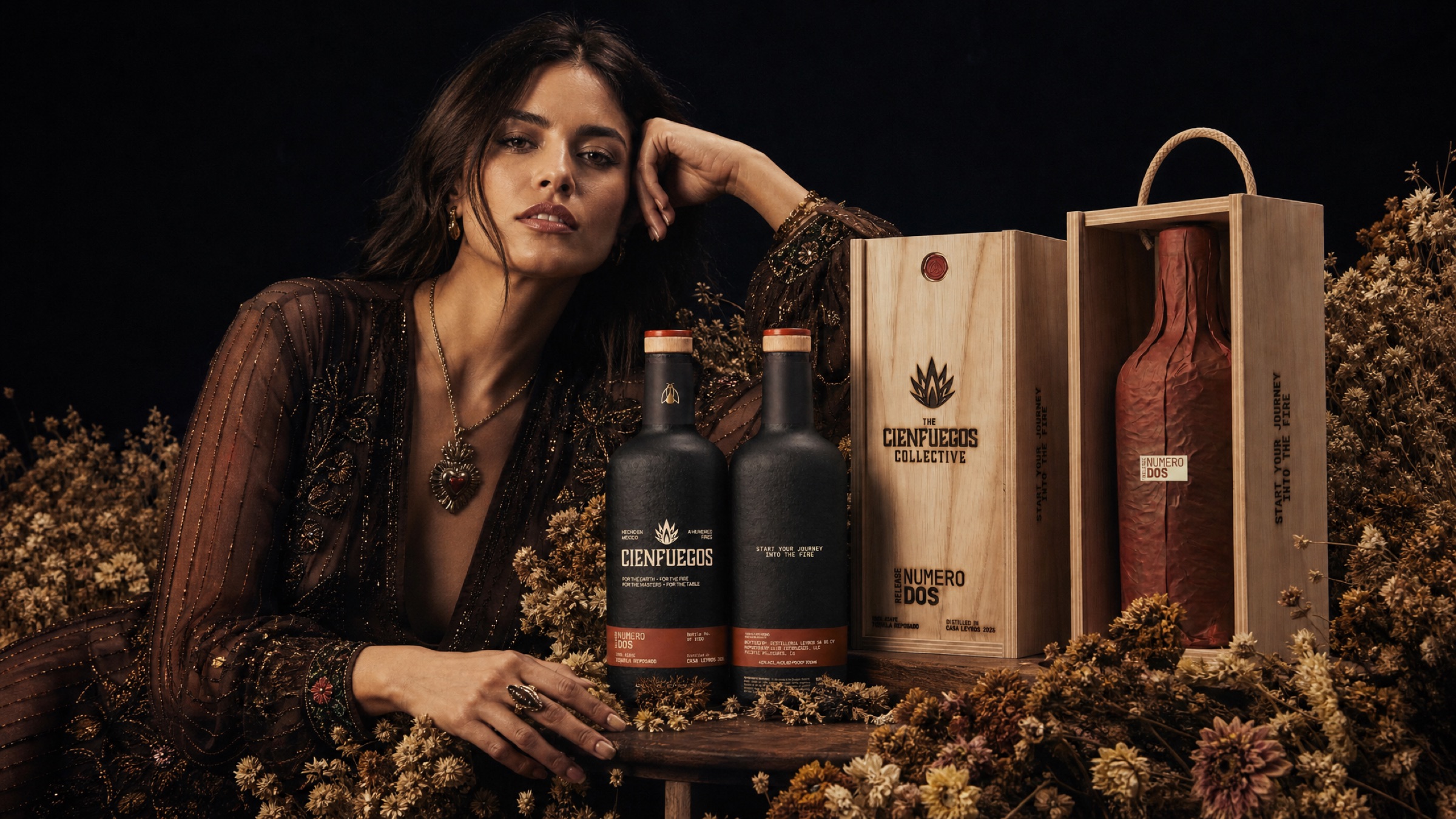
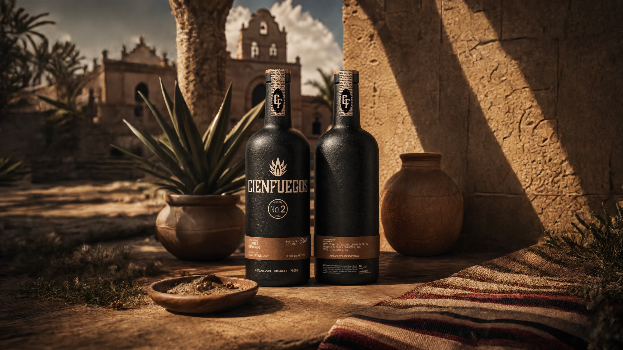
Cienfuegos is a members-only tequila club. Around six hundred members, one release at a time, bottled in custom ceramic from Hidalgo and numbered by hand. Members do not walk into a store and find it. They wait for a release, and the bottle arrives as an object before it is ever a drink.

The brief that arrived was gold-accent heritage tequila. Gold foil, green glass, a hacienda, a script wordmark. It is what the entire category already looks like, and it is the reason a shelf of premium tequila reads as one continuous blur.

Release No. 2 was the first release designed as a platform rather than a one-off: one bottle that had to survive being made ten different ways.
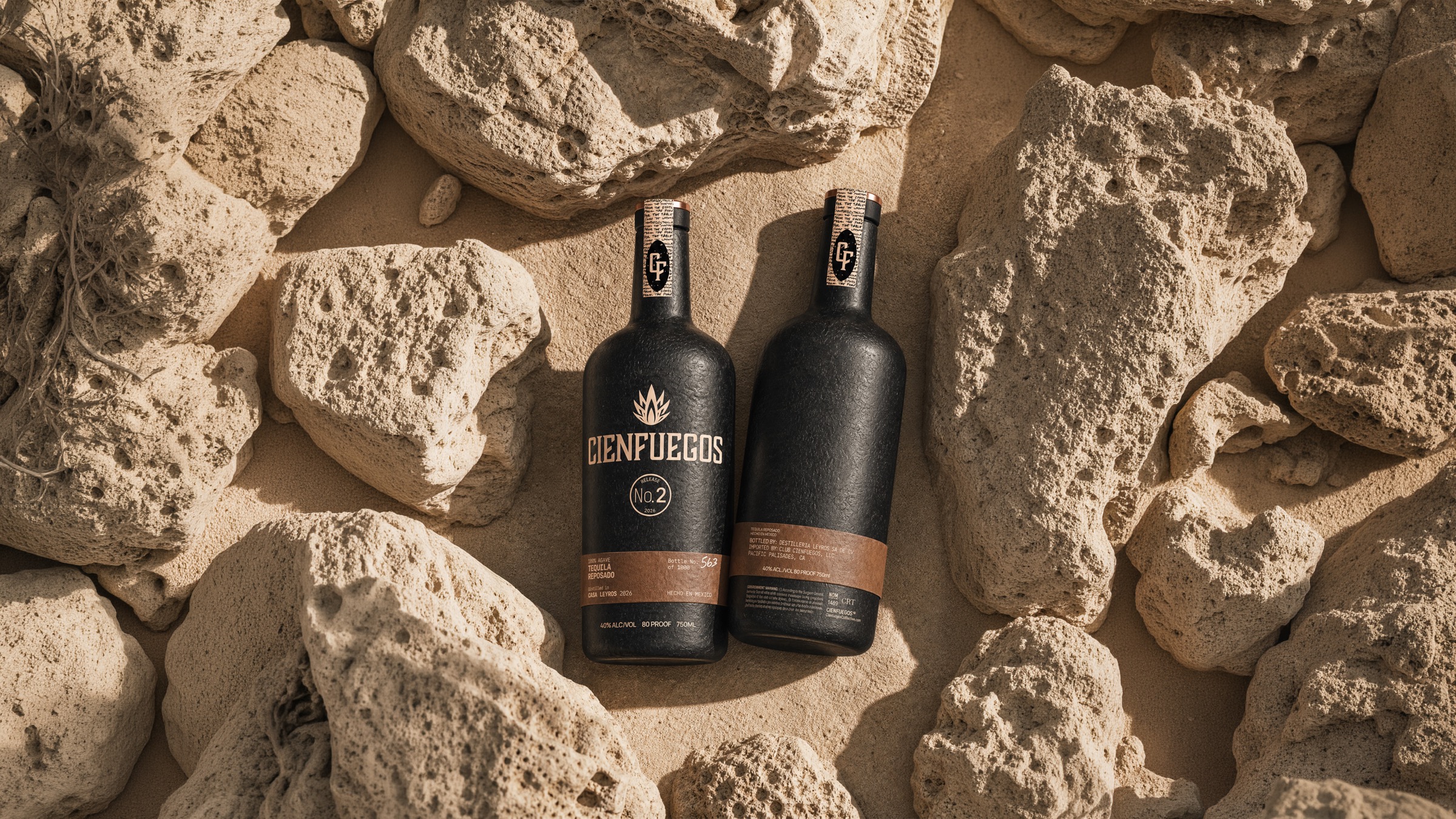
"The ceramic is earth after the burn. Nothing on the bottle pretends to be gold."
Creative Direction, Release No. 2
PQ #001 79 Characters
GOLD FOIL GREEN GLASS SCRIPT WORDMARK HACIENDA EMBOSSED CREST METALLIC INK ONE-OFF PACKAGING NO VARIANT SYSTEM NO PLATFORM NO RULES
600
Members waiting on each release
1000
Bottles numbered by hand per release
10
Variants the identity had to survive

A members-only club releases variants constantly. The identity had to hold across all of them without a new mold, a new system, or a new argument every time.

The real problem underneath the brief was structural, not decorative. The brand had to be a set of rules, not a look.

Gold was never a taste question. It was a scale question. An accent that has to be re-decided every release is a cost, not a system.

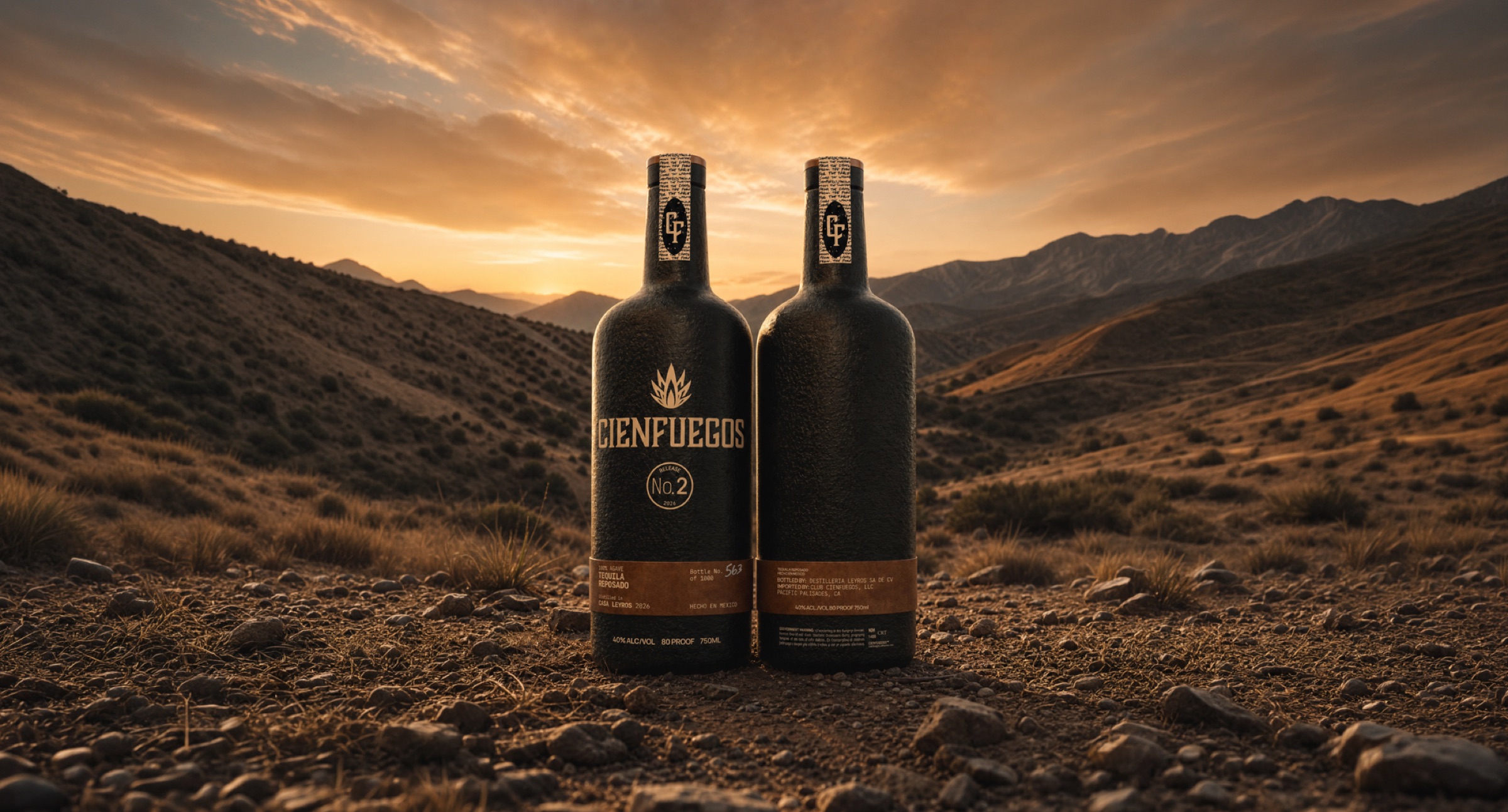
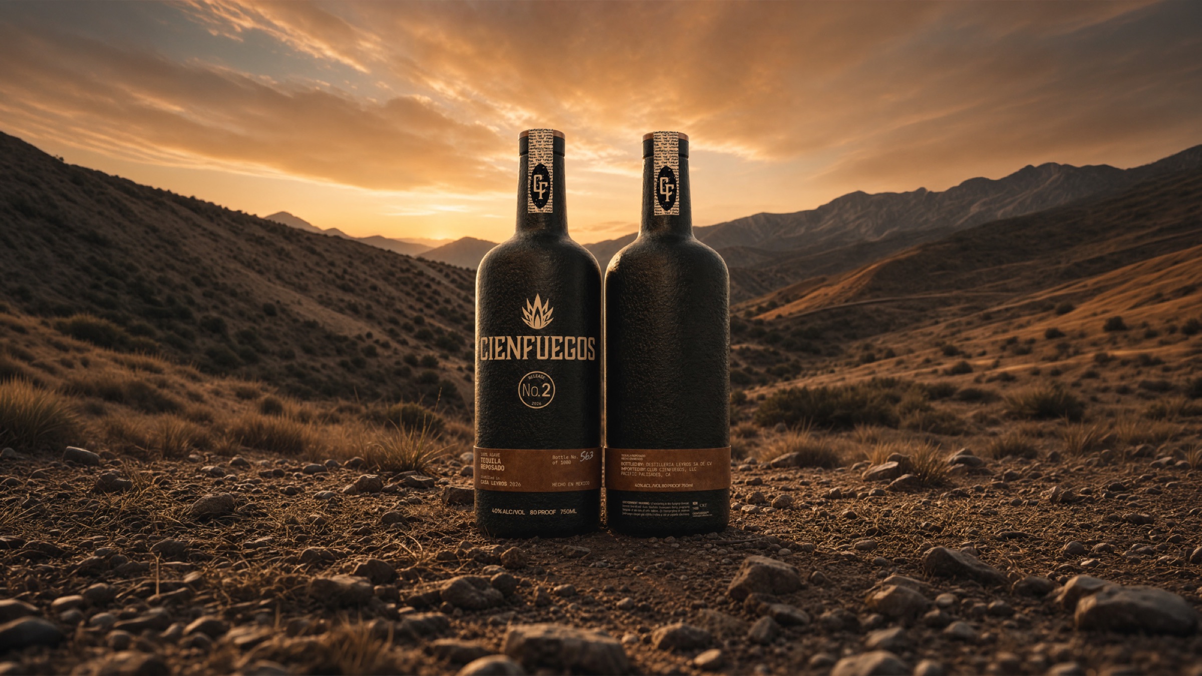
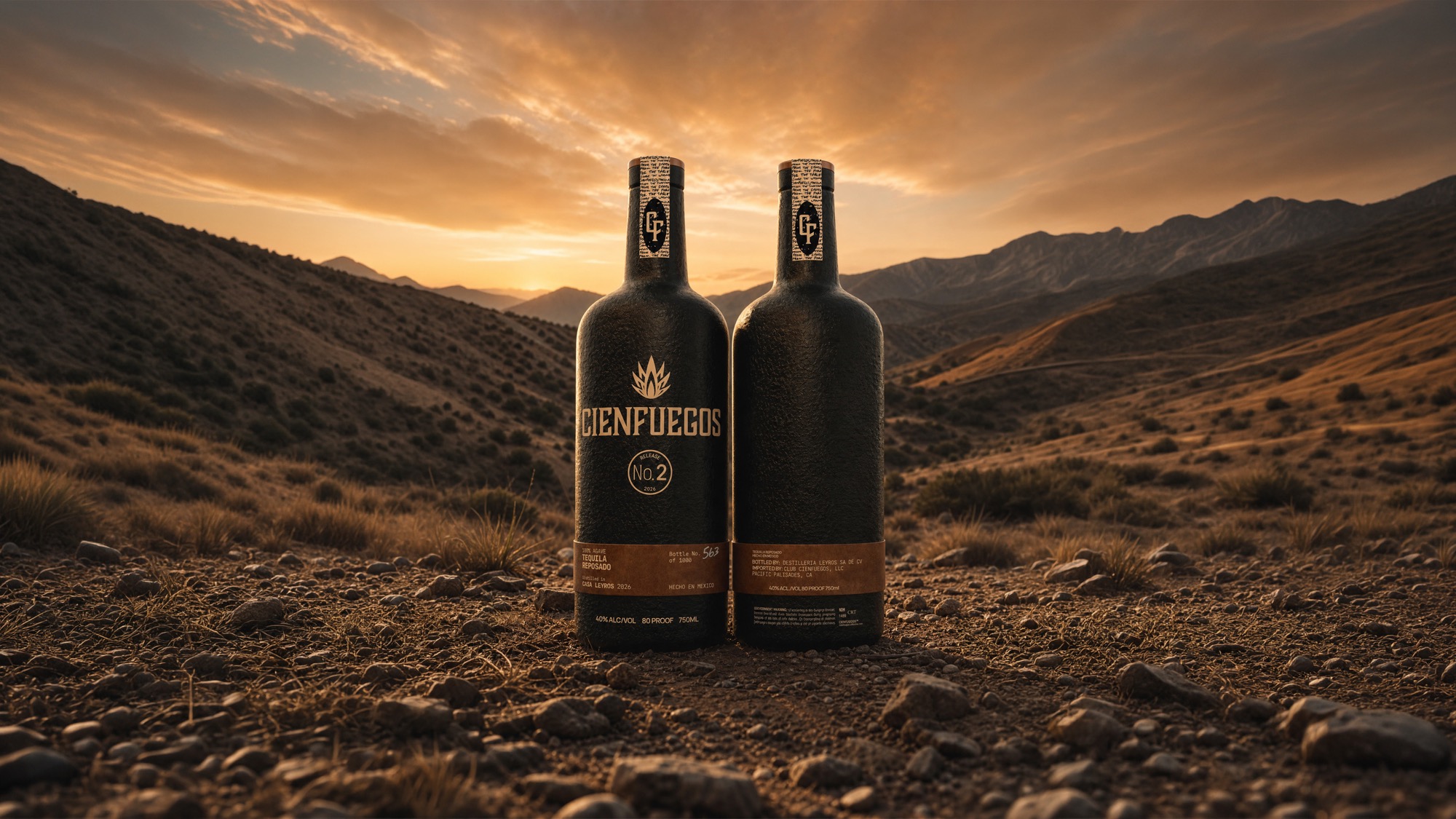
Cienfuegos Release No. 2 in landscape
world.jpg
Title: The Approach
The Approach

The reframe was one sentence: Cienfuegos is the beautiful thing fire leaves behind. Not the flame, not the heat, the aftermath. That single move decided every material question that followed, and it took gold off the table permanently.

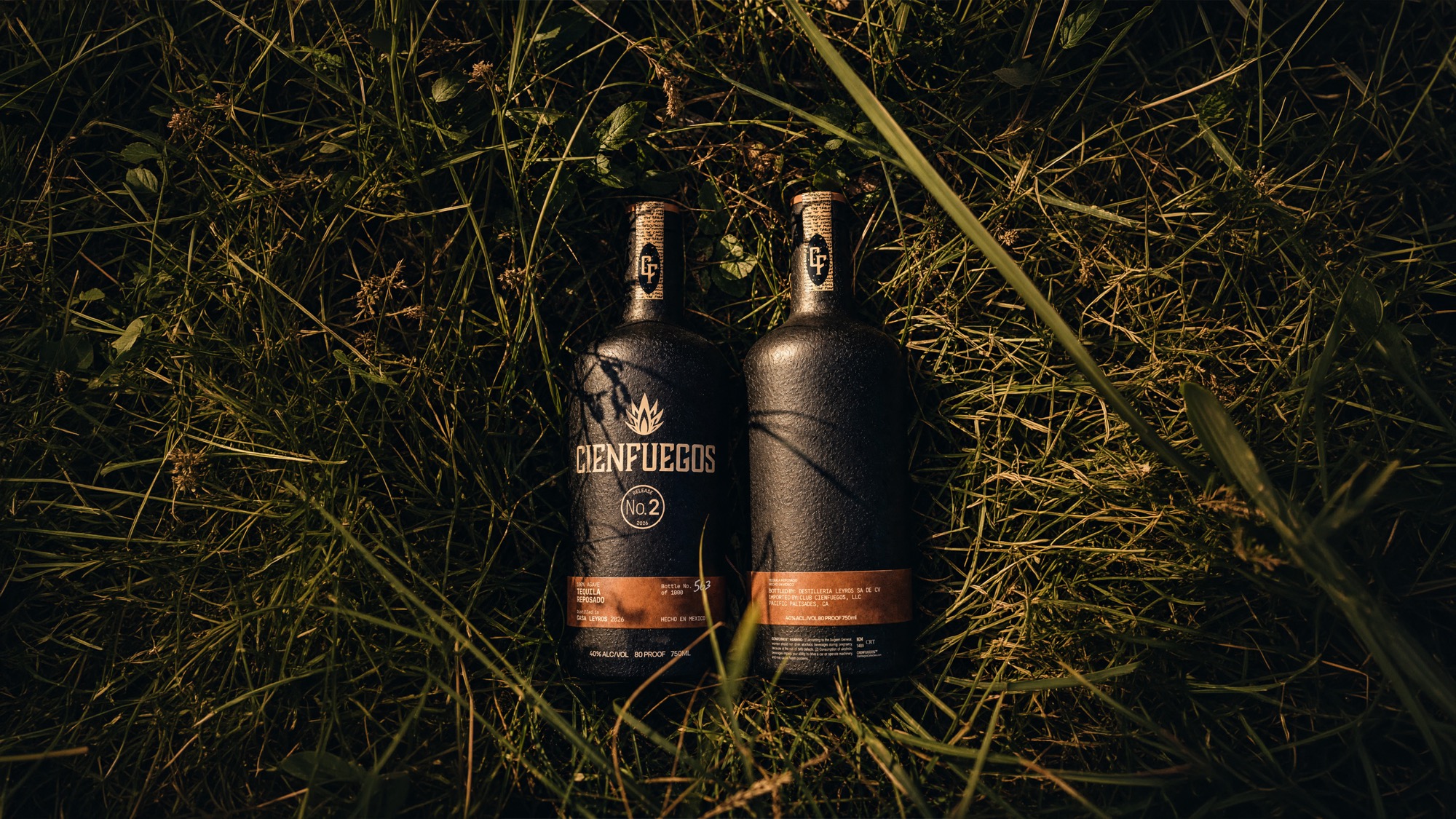
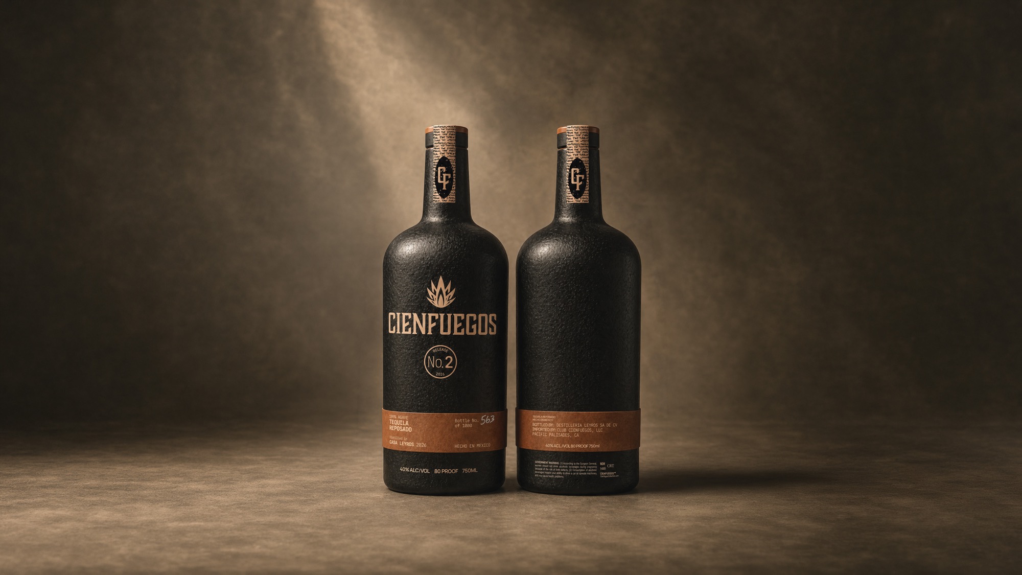
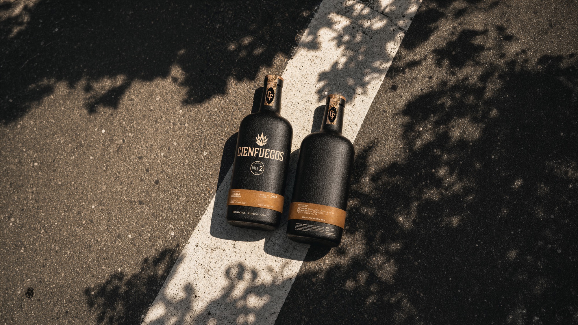
Matte black ceramic became the primary surface, textured rather than glazed, so the bottle reads as earth after a burn instead of as luxury packaging. The palette narrowed to ash, sand, moss, clay, and char, with no metallic anywhere in the build.

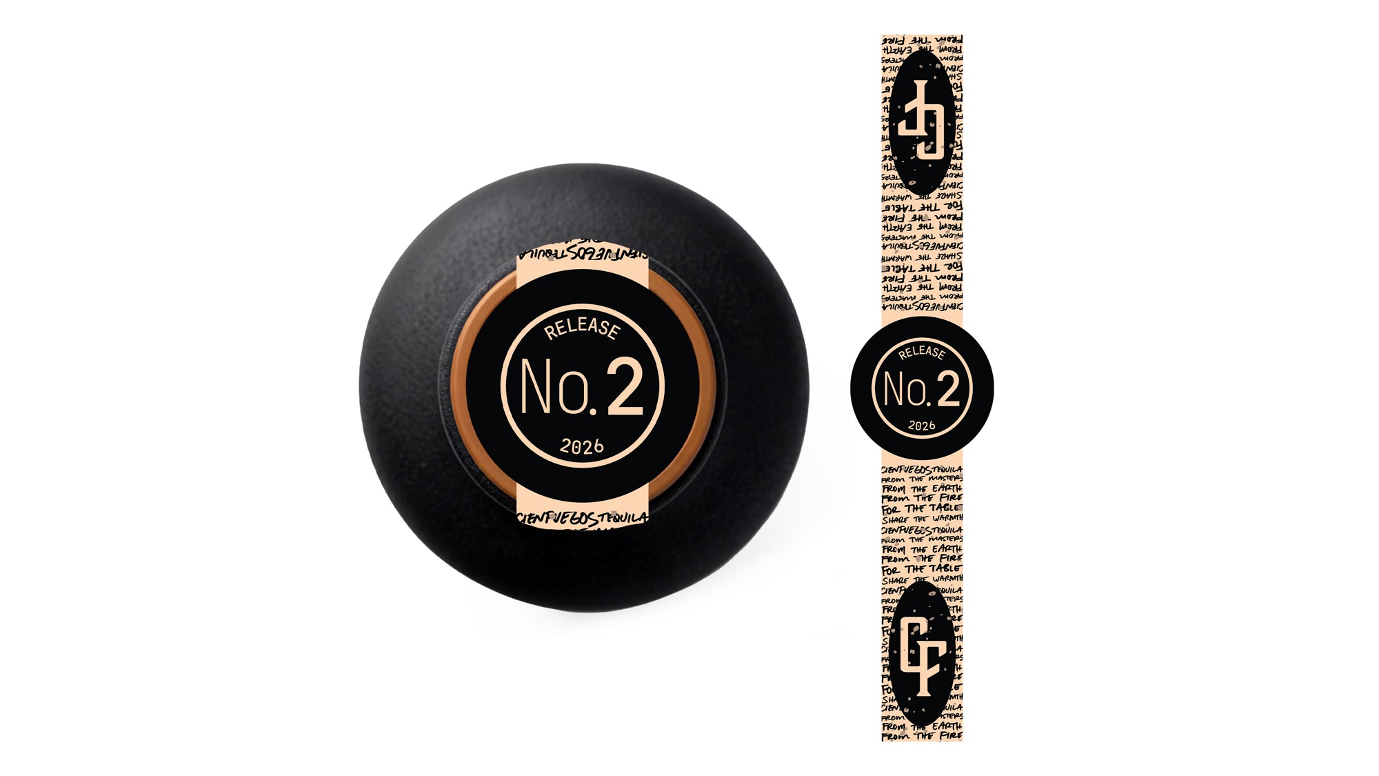
The variant system does the heavy lifting. A leather colorway band wraps the lower third of the bottle, and that band is the only element that changes between variants. One mold, one ceramic body, one wordmark, ten releases. The band carries the release information so the ceramic never has to.

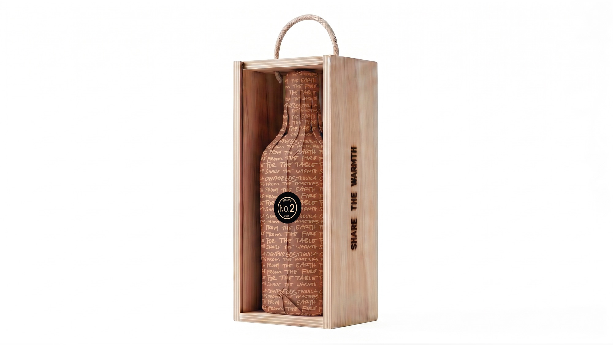
The wordmark was rebuilt as a restrained condensed serif with a single agave flame above it, and then left alone. The closure is a blonde bartop cork under a numbered seal, so scarcity is legible on the object itself.

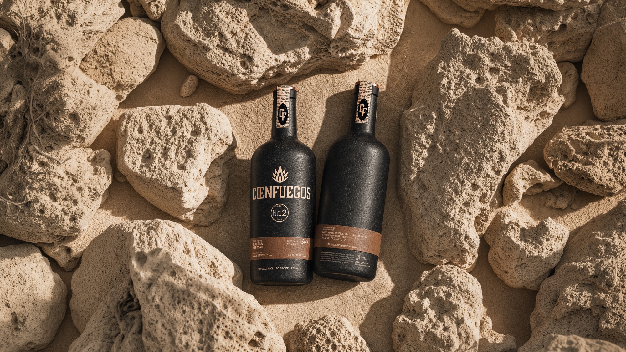
Cienfuegos Release No. 2 bottles on volcanic rock
approach.jpg
"Kill the gold. Build it from the ash."
Evan Roberts, Lead Designer
PQ #002 The Reframe 36 Characters
Key Decisions
Decision Outcome
Matte black ceramic over gold-accent heritage Took the category default off the table and made every later material decision follow one rule.
Leather band as the only variable element Ten colorways ship from one mold and one ceramic body. No retooling per variant.
Release data carried on the band and seal The ceramic body never has to be remade when a release changes.
Glass tier built on the same silhouette A member complaint became a product line instead of an exception to the system.
Scope of Work
Feb 26 Mar 26 Apr 26 May 26 Jun 26
Identity & Direction 4 wk
Bottle Platform 6 wk
Colorway System 4 wk
Packaging & Seal 5 wk
Glass Variant Tier 3 wk
Membership Site cont.
Title: Brand System
The System

A bottle platform rather than a bottle. Silhouette, ceramic body, band placement, seal, neck strip, and the rules that decide which of them may change. One system. Every release.

The system is written so a ceramicist in Hidalgo, a leather supplier, and a fulfilment team all read the same answer. It specifies proportion and sequence, not preference, so a new colorway is a decision already made.
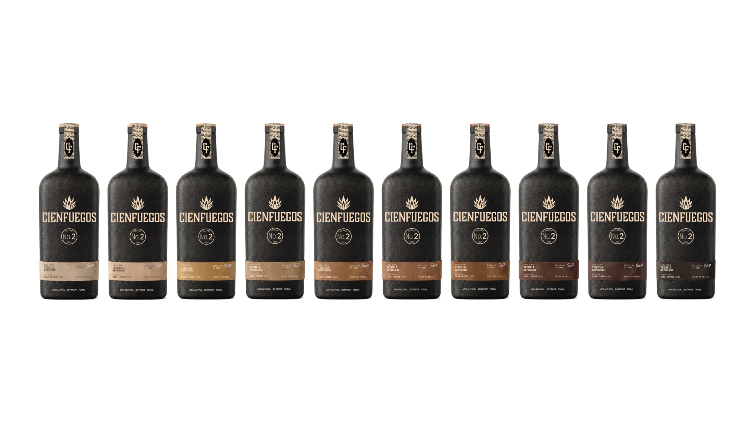
Bottle platform 01 Bottle platform 02 Bottle platform 03 Bottle platform 04 Bottle platform 05 Bottle platform 06
Title: The Member Site
The Member Site

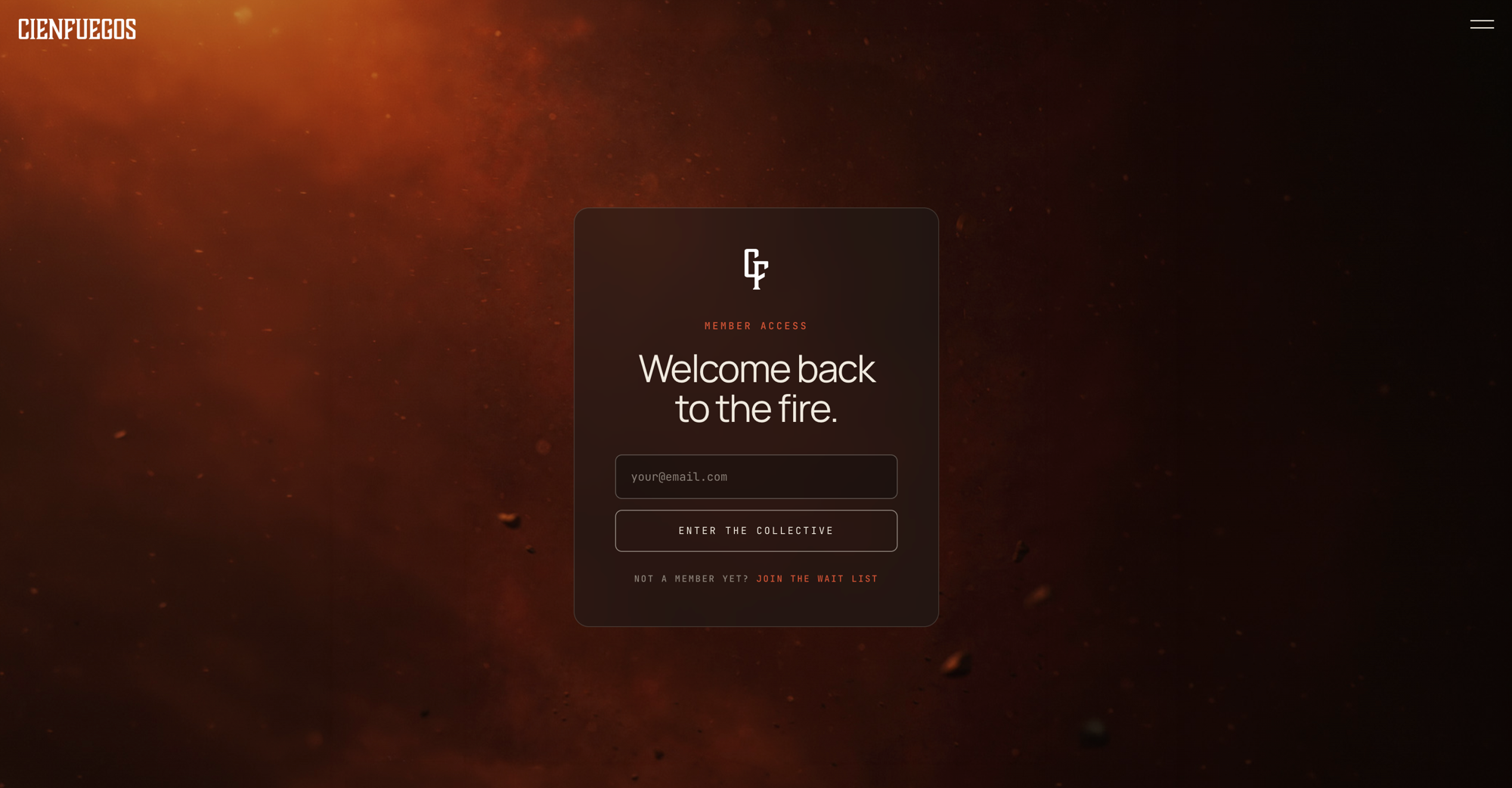
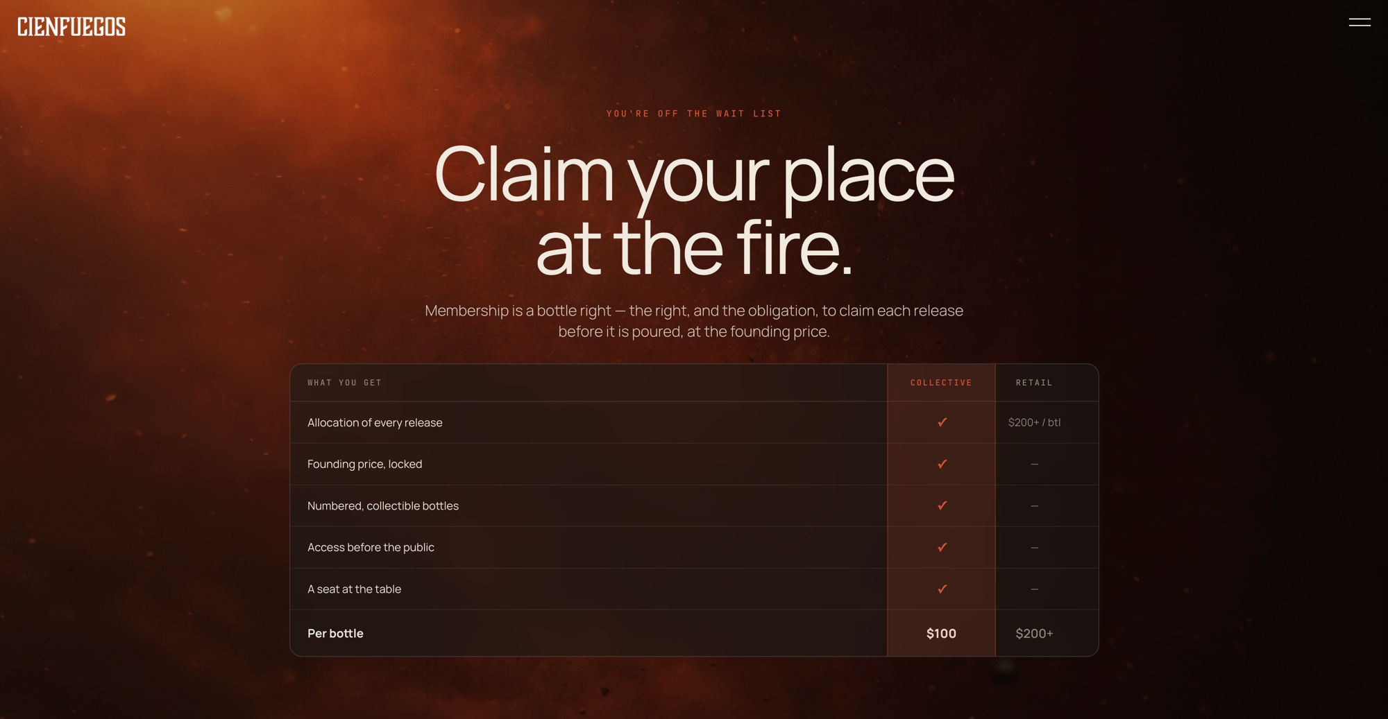
A members-only site built directly in code: waitlist, access flow, member dashboard, and the bottle-rights logic that governs what a membership actually holds. No mockups. No handoffs. What I designed is what shipped.

This is what I call Direct Design. Build directly in the medium. The browser is the canvas. The feedback loop collapses from weeks to minutes. Every decision is tested against real constraints, real content, real devices. Not a simulation of a website. The website.

Member access screen Membership and bottle rights screen

The member site is private, behind the club's access flow.

Title: Results
The Results
One Mold. Ten Variants.
10
Colorway variants shipping from a single ceramic mold
3
Glass finishes added without changing the silhouette
1000
Bottles per release, numbered by hand against the run
Before After
Gold-accent heritage direction Matte black ceramic platform with no metallic anywhere in the build
One-off packaging per release One mold and one band system carrying ten colorway variants
Opaque bottle hiding its own fill Glass tier in clear flint, smoked, and amber on the same silhouette
Release information printed on the body Release number and year carried on the seal and the band
No membership infrastructure Member site with waitlist, access flow, and bottle rights
"The complaint became a product line."
Release No. 2, Glass Tier
PQ #003 36 Characters
Photography
photo-01.jpg
photo-02.jpg
photo-03.jpg
photo-04.jpg
photo-05.jpg
photo-06.jpg
Title: Reflection
What I Would Do Differently

With more time I would have built the glass tier into the first platform document instead of adding it after the members found the flaw. The complaint was correct and it was predictable. What surprised me is how much work one sentence did. Once the brand was the thing fire leaves behind, the material questions stopped being opinions and started having answers.

This platform is ongoing. Releases keep coming. But the rules are set, and they are set so that a new variant costs a band and not a rebuild.

Evan Roberts
Evan Roberts
Lead Designer, Roberts Design Studio
Roberts Design Studio is an American design company specializing in brand, package, digital, and web design.Make It Real